
XY chart (Mermaid)
When you want a quick chart and Vega-Lite feels like overkill, Mermaid's XY chart draws bars and lines from two arrays of numbers.
#What this example shows
A bar series and a line series on the same axes.
Explicit axis ranges, so the scale is stated.
Data written inline, which keeps it reviewable.
#A worked example
Open it, edit it, or copy the source below.
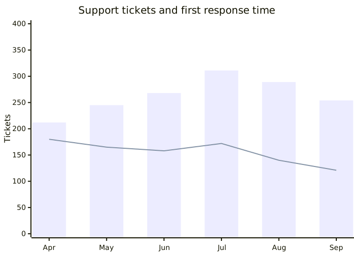
The source, which you can paste into a new diagram and edit:
#Making it your own
Both series share one y-axis, so scale them to be comparable or use two charts.
For anything with a legend, colours or grouping, use Vega-Lite instead.
The data is a snapshot embedded in the page. Say when it was taken.
#Related
Copy it. Change one line. See what happens.























