
Radar chart
A radar chart plots several measures around a circle, one axis each. It is good for comparing two or three entities against the same criteria, and bad at almost everything else.
Area on a radar chart is meaningless, and reordering the axes changes the shape entirely. Use it knowingly.
#When this is the right chart
Comparing two or three options against fixed criteria.
Capability or skill assessments.
Scorecards where the axes are agreed in advance.
#What the data needs to look like
Field | Type |
|---|---|
Criterion | Nominal: one axis each |
Value | Quantitative, on a shared scale |
Entity | Nominal: one shape each |
#A worked example
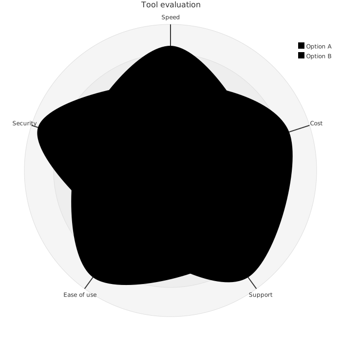
Two candidate tools against five criteria:
The source, which you can paste into a new diagram and edit:
#A few things that catch people out
Every axis must use the same scale, or the shape is meaningless.
Two or three entities at most. Overlapping shapes become unreadable quickly.
The order of the axes changes the shape. Agree it before anybody sees the chart.
#Related
Pick the chart for the question, not for the look.























