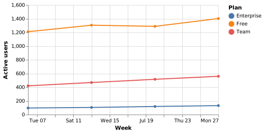
Line chart (Vega-Lite)
A line chart needs three things: a temporal field, a quantitative field, and optionally a nominal field for the series.
#What this example shows
A temporal field type, which produces a date axis.
A colour channel, which splits the data into series.
Points on the line, set on the mark.
#A worked example
Open it, edit it, or copy the source below.
The source, which you can paste into a new diagram and edit:
{
  "$schema": "https://vega.github.io/schema/vega-lite/v5.json",
  "description": "Weekly active users by plan",
  "width": 380,
  "height": 220,
  "data": {"values": [
    {"week": "2026-07-06", "plan": "Free", "users": 1210},
    {"week": "2026-07-13", "plan": "Free", "users": 1305},
    {"week": "2026-07-20", "plan": "Free", "users": 1288},
    {"week": "2026-07-27", "plan": "Free", "users": 1402},
    {"week": "2026-07-06", "plan": "Team", "users": 420},
    {"week": "2026-07-13", "plan": "Team", "users": 468},
    {"week": "2026-07-20", "plan": "Team", "users": 515},
    {"week": "2026-07-27", "plan": "Team", "users": 559},
    {"week": "2026-07-06", "plan": "Enterprise", "users": 96},
    {"week": "2026-07-13", "plan": "Enterprise", "users": 104},
    {"week": "2026-07-20", "plan": "Enterprise", "users": 118},
    {"week": "2026-07-27", "plan": "Enterprise", "users": 131}
  ]},
  "mark": {"type": "line", "point": true},
  "encoding": {
    "x": {"field": "week", "type": "temporal", "title": "Week"},
    "y": {"field": "users", "type": "quantitative", "title": "Active users"},
    "color": {"field": "plan", "type": "nominal", "title": "Plan"}
  }
}
#Making it your own
Set the type to temporal or the dates become unordered categories.
Series on very different scales are better as separate charts than one.
point: true makes individual observations visible, which matters with few data points.
A real chart in about ten lines.