
Bar chart
The bar chart is the default answer to "how do these compare?", and it is right far more often than the charts people reach for instead.
Sort by value unless the categories have a natural order. An unsorted bar chart makes the reader do the ranking.
#When this is the right chart
Comparing a measure across categories.
Rankings, where the order is the point.
Anywhere somebody is about to use a pie chart with more than five slices.
#What the data needs to look like
Field | Type |
|---|---|
Category | Nominal: a name per bar |
Value | Quantitative: the bar length |
#A worked example
Support tickets by category, sorted:
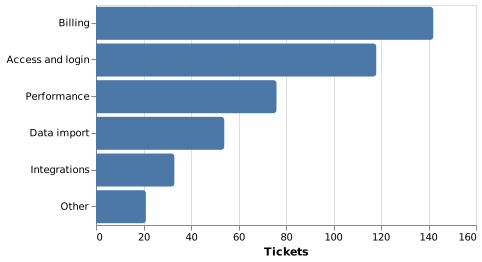
The source, which you can paste into a new diagram and edit:
#A few things that catch people out
Horizontal bars handle long category names; vertical bars do not.
Start the value axis at zero. A truncated axis exaggerates differences.
Above about fifteen bars, consider a table.
#Related
Pick the chart for the question, not for the look.























