
Histogram
A histogram bins a single measure and counts what falls in each bin. It answers a question averages hide: what does the distribution actually look like?
Latency, file size and score data all have long tails that a mean will happily conceal.
#When this is the right chart
Latency and performance data, which is never normally distributed.
File sizes, scores and any measure with outliers.
Before choosing an average, to check whether one is meaningful.
#What the data needs to look like
Field | Type |
|---|---|
Value | Quantitative: the measure to bin |
Bin | Set on the encoding, not in the data |
#A worked example
Request latency, binned:
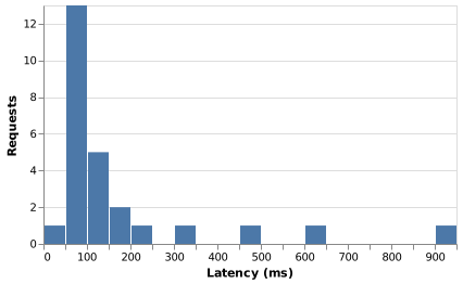
The source, which you can paste into a new diagram and edit:
#A few things that catch people out
Bin width changes the story. Try two or three before settling on one.
Histogram bars touch; bar chart bars do not. The gap means categories.
A long tail is usually the finding. Do not truncate the axis to hide it.
#Related
Pick the chart for the question, not for the look.























