
Quadrant chart
A quadrant chart plots items against two dimensions, and its value is entirely in the axes you choose. Effort against impact is the classic pair, and the diagram is really a way of forcing that conversation.
Because it is text, people can move a dot during the meeting rather than after it.
#When to reach for one
Prioritisation workshops where everything is currently urgent.
Risk assessment: likelihood against impact.
Competitive or capability positioning.
#How to draw it in Capable
Route | Use when |
|---|---|
Mermaid | A dedicated quadrant syntax; fastest to build and change. |
Excalidraw | Workshops, where dragging dots around is the exercise. |
#A worked example
Effort against impact, with the quadrants named:
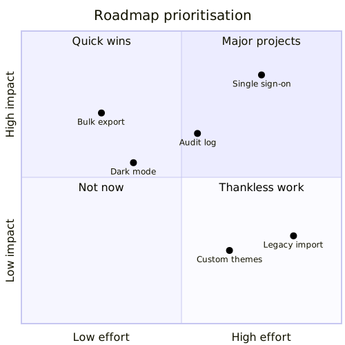
The source, which you can paste into a new diagram and edit:
#A few things that catch people out
Name the quadrants. Unnamed quadrants leave everyone reading their own meaning into the corners.
Positions are opinions. Record who placed them, and revisit after the work is done.
Two axes only. A third dimension needs a different chart.
#Related
Keep the numbers where people can check them.























