
Data lineage diagram
Lineage answers the question that follows every wrong number: where did this come from? A lineage diagram traces a field from the source system, through each transformation, to the dashboard someone is looking at.
Generate it if your platform can. Draw it if not; an approximate lineage diagram beats none.
#When to reach for one
Debugging a metric nobody trusts.
Impact analysis before changing a source system.
Governance and audit, where provenance has to be demonstrated.
#How to draw it in Capable
Route | Use when |
|---|---|
Graphviz | Generated lineage; DOT is what most tools emit. |
D2 | Hand-maintained lineage that needs to stay readable. |
#A worked example
Lineage for one revenue metric:
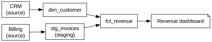
The source, which you can paste into a new diagram and edit:
#A few things that catch people out
Lineage at field level is far more useful than at table level, and far harder to maintain.
Mark which hops are automated and which are somebody exporting a spreadsheet.
Regenerate rather than edit; lineage drifts faster than almost any other diagram.
#Related
Get the cardinality right and the rest follows.























