
Dependency graph
Dependency graphs are the one diagram you should almost never draw manually. They are generated by tooling, and DOT is the format most tools already emit.
Paste the DOT output into a diagram and it renders, versioned, on the page.
#When to reach for one
Package or module dependency trees from a build tool.
Service call graphs exported from tracing.
Build pipelines, where the order is derived from dependencies.
#How to draw it in Capable
Route | Use when |
|---|---|
Graphviz | The format your tooling already produces. |
Mermaid | Small, hand-maintained graphs where DOT is overkill. |
#A worked example
A module dependency graph, with a cycle worth arguing about:
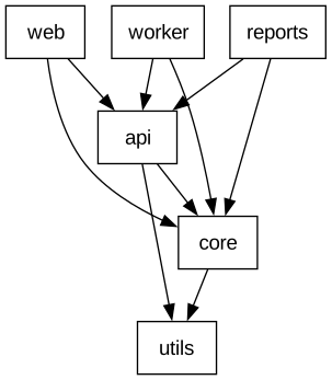
The source, which you can paste into a new diagram and edit:
#A few things that catch people out
Regenerate rather than edit. A hand-edited dependency graph is wrong within a week.
Cycles are the reason to draw this at all; make them visible rather than tidying them away.
Very large graphs hit the rendering limits. Filter before you paste. See Reference.
#Related
Cheap to change means it stays true.























