
Stacked bar chart
A stacked bar shows a total per category and how it breaks down. A normalised stacked bar drops the total and shows proportion instead, which is a different question.
Decide which question you are answering before choosing between them.
#When this is the right chart
Comparing totals while also showing composition.
Proportions across categories, using the normalised form.
Status breakdowns across teams, projects or periods.
#What the data needs to look like
Field | Type |
|---|---|
Category | Nominal: one bar each |
Series | Nominal: the segments |
Value | Quantitative |
#A worked example
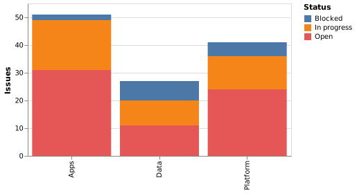
Issue status by team, stacked:
The source, which you can paste into a new diagram and edit:
#A few things that catch people out
Only the bottom segment is easy to compare across bars. Put the important one there.
For proportions, set the stack to normalize and drop the totals.
Three or four segments is the practical limit.
#Related
Pick the chart for the question, not for the look.























