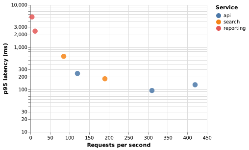
A scatter plot in Vega is a symbol mark with x and y encodings, plus whatever extra channels you want to add.
Open it, edit it, or copy the source below.
{
  "$schema": "https://vega.github.io/schema/vega/v5.json",
  "width": 360,
  "height": 260,
  "padding": 5,
  "data": [{
    "name": "points",
    "values": [
      {"endpoint": "/orders", "rps": 120, "p95": 240, "service": "api"},
      {"endpoint": "/orders/:id", "rps": 310, "p95": 95, "service": "api"},
      {"endpoint": "/catalogue", "rps": 420, "p95": 130, "service": "api"},
      {"endpoint": "/search", "rps": 85, "p95": 610, "service": "search"},
      {"endpoint": "/suggest", "rps": 190, "p95": 180, "service": "search"},
      {"endpoint": "/reports", "rps": 12, "p95": 2400, "service": "reporting"},
      {"endpoint": "/export", "rps": 4, "p95": 5200, "service": "reporting"}
    ]
  }],
  "scales": [
    {"name": "x", "type": "linear", "domain": {"data": "points", "field": "rps"}, "range": "width", "nice": true, "zero": true},
    {"name": "y", "type": "log", "domain": {"data": "points", "field": "p95"}, "range": "height", "nice": true},
    {"name": "color", "type": "ordinal", "domain": {"data": "points", "field": "service"}, "range": {"scheme": "tableau10"}}
  ],
  "axes": [
    {"orient": "bottom", "scale": "x", "title": "Requests per second", "grid": true},
    {"orient": "left", "scale": "y", "title": "p95 latency (ms)", "grid": true}
  ],
  "legends": [{"fill": "color", "title": "Service"}],
  "marks": [{
    "type": "symbol",
    "from": {"data": "points"},
    "encode": {
      "enter": {
        "x": {"scale": "x", "field": "rps"},
        "y": {"scale": "y", "field": "p95"},
        "size": {"value": 110},
        "fill": {"scale": "color", "field": "service"},
        "fillOpacity": {"value": 0.85}
      }
    }
  }]
}