
Word cloud
A word cloud sizes terms by a weight. It is a poor analytical chart, because comparing font sizes is imprecise, and a genuinely useful summary graphic when precision is not the goal.
Use it to convey a shape at a glance, then put the numbers in a table underneath.
#When this is the right chart
Summarising themes in feedback or survey responses.
An opening graphic for a report whose detail follows.
Showing which terms dominate a corpus.
#What the data needs to look like
Field | Type |
|---|---|
Term | Nominal |
Weight | Quantitative: drives the size |
#A worked example
Terms sized by frequency:
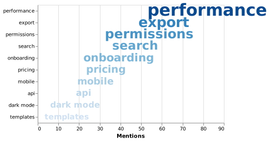
The source, which you can paste into a new diagram and edit:
#A few things that catch people out
Font size is read imprecisely. Never use a word cloud to make a close comparison.
Strip stop words first, or the biggest term will be "the".
Put a sorted table of the same numbers underneath. It costs nothing and answers the follow-up question.
#Related
Pick the chart for the question, not for the look.























