
Box plot
A box plot compresses a distribution into five numbers and shows the outliers separately. It is the right chart when comparing distributions across groups rather than a single average.
Anybody comparing performance across services or teams should be looking at one of these rather than at a bar chart of means.
#When this is the right chart
Comparing distributions across groups.
Performance data, where the tail matters more than the mean.
Any comparison currently being made with averages.
#What the data needs to look like
Field | Type |
|---|---|
Group | Nominal |
Value | Quantitative: the raw measurements |
#A worked example
Latency by service, showing the spread:
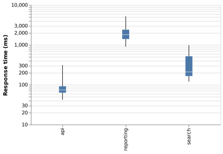
The source, which you can paste into a new diagram and edit:
#A few things that catch people out
Say what the whiskers mean. Min-max and 1.5 times the interquartile range are both common and different.
Box plots hide bimodal distributions. If you suspect one, use a histogram too.
With few data points per group, plot the points instead. A box plot of five values is theatre.
#Related
Pick the chart for the question, not for the look.























