
Scatter plot

A scatter plot puts one measure on each axis and a dot per item. It is the only chart here that answers "are these two things related?", and it answers it honestly, including when the answer is no.

Add a colour dimension for a category if it helps; add a size dimension and it becomes a bubble chart.


#When this is the right chart

  • Looking for correlation between two measures.

  • Spotting outliers, which stand out immediately.

  • Showing a distribution of items rather than an aggregate.


#What the data needs to look like

Field

Type

X

Quantitative

Y

Quantitative

Colour

Nominal, optional


#A worked example

Response time against request volume, coloured by service:
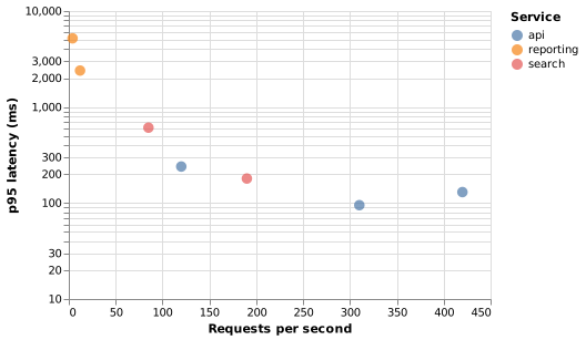
Scatter plot

The source, which you can paste into a new diagram and edit:

{
  "$schema": "https://vega.github.io/schema/vega-lite/v5.json",
  "description": "Latency against throughput by endpoint",
  "width": 380,
  "height": 260,
  "data": {"values": [
    {"endpoint": "/orders", "rps": 120, "p95": 240, "service": "api"},
    {"endpoint": "/orders/:id", "rps": 310, "p95": 95, "service": "api"},
    {"endpoint": "/search", "rps": 85, "p95": 610, "service": "search"},
    {"endpoint": "/catalogue", "rps": 420, "p95": 130, "service": "api"},
    {"endpoint": "/reports", "rps": 12, "p95": 2400, "service": "reporting"},
    {"endpoint": "/export", "rps": 4, "p95": 5200, "service": "reporting"},
    {"endpoint": "/suggest", "rps": 190, "p95": 180, "service": "search"}
  ]},
  "mark": {"type": "point", "filled": true, "size": 90},
  "encoding": {
    "x": {"field": "rps", "type": "quantitative", "title": "Requests per second"},
    "y": {"field": "p95", "type": "quantitative", "title": "p95 latency (ms)", "scale": {"type": "log"}},
    "color": {"field": "service", "type": "nominal", "title": "Service"},
    "tooltip": [{"field": "endpoint"}, {"field": "rps"}, {"field": "p95"}]
  }
}

#A few things that catch people out

  • Correlation is not causation, and a scatter plot is very persuasive. Say what you actually know.

  • A log scale is often the honest choice when values span orders of magnitude.

  • Overlapping points hide density. Reduce opacity or reduce the point size.


Pick the chart for the question, not for the look.























