
Profiling diagram (Excalidraw)
Performance conversations go better with a picture. This one draws each stage of a request as a bar proportional to its duration, which makes the argument immediately.
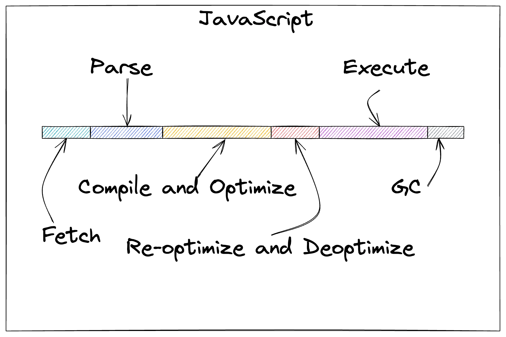
#What this example shows
Bars sized in proportion to real measurements.
A total across the top, so the parts add up visibly.
The slow stage highlighted, with the number written on it.
#How to build it
Step | What you do |
|---|---|
1 | Draw a horizontal axis and label it with the total duration. |
2 | Draw one bar per stage, sized in proportion to its measured time. |
3 | Write the actual milliseconds on each bar; the picture is an aid, not the data. |
4 | Highlight the dominant stage in a different colour. |
5 | Annotate what you intend to change and what you expect the effect to be. |
#Making it your own
Write the numbers on. A proportional sketch without figures invites argument.
Draw the before and after side by side once you have made the change.
For repeatable measurement, use a chart; this is for the conversation.
#Related
Rough on purpose, and quicker for it.























