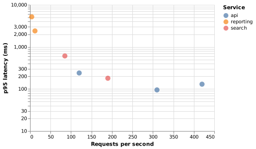
Scatter chart (Vega-Lite)
A scatter chart is where Vega-Lite's brevity is most obvious: four encodings and you have a chart with a legend and tooltips.
#What this example shows
A log scale, declared inline on the encoding.
A tooltip listing several fields.
Point size and fill set on the mark.
#A worked example
Open it, edit it, or copy the source below.
The source, which you can paste into a new diagram and edit:
{
  "$schema": "https://vega.github.io/schema/vega-lite/v5.json",
  "description": "Latency against throughput by endpoint",
  "width": 380,
  "height": 260,
  "data": {"values": [
    {"endpoint": "/orders", "rps": 120, "p95": 240, "service": "api"},
    {"endpoint": "/orders/:id", "rps": 310, "p95": 95, "service": "api"},
    {"endpoint": "/catalogue", "rps": 420, "p95": 130, "service": "api"},
    {"endpoint": "/search", "rps": 85, "p95": 610, "service": "search"},
    {"endpoint": "/suggest", "rps": 190, "p95": 180, "service": "search"},
    {"endpoint": "/reports", "rps": 12, "p95": 2400, "service": "reporting"},
    {"endpoint": "/export", "rps": 4, "p95": 5200, "service": "reporting"}
  ]},
  "mark": {"type": "point", "filled": true, "size": 110},
  "encoding": {
    "x": {"field": "rps", "type": "quantitative", "title": "Requests per second"},
    "y": {"field": "p95", "type": "quantitative", "title": "p95 latency (ms)", "scale": {"type": "log"}},
    "color": {"field": "service", "type": "nominal", "title": "Service"},
    "tooltip": [
      {"field": "endpoint", "title": "Endpoint"},
      {"field": "rps", "title": "RPS"},
      {"field": "p95", "title": "p95 (ms)"}
    ]
  }
}
#Making it your own
Scales are declared on the encoding, not separately. That is the main Vega-Lite shortcut.
Tooltips cost one line and save a legend of labels.
Correlation is not causation, and a scatter chart is persuasive. Be careful what you claim.
A real chart in about ten lines.