
Radar chart (Mermaid)
Radar charts compare a few entities across fixed criteria. They are easy to misuse, so keep the entities to two or three and the scale shared.
#What this example shows
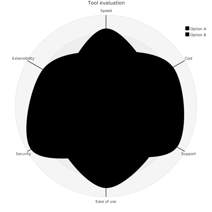
Axes declared once and shared by every curve.
An explicit min and max, so the scale is stated rather than inferred.
Two curves, which is where a radar chart is still readable.
#A worked example
Open it, edit it, or copy the source below.
The source, which you can paste into a new diagram and edit:
#Making it your own
Every axis must share a scale, or the shape means nothing.
Reordering the axes changes the shape entirely. Agree the order first.
Two or three curves at most before it becomes unreadable.
#Related
Copy it. Change one line. See what happens.























