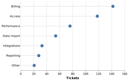
Dot plot (Vega)
A dot plot puts a single point per category on a shared axis. It carries the same information as a bar chart with far less ink, and it reads well at high category counts.
#What this example shows
A point scale for the categories.
A rule mark drawing the connecting line to zero.
Sorted categories, driven by the data.
#A worked example
Open it, edit it, or copy the source below.
The source, which you can paste into a new diagram and edit:
{
  "$schema": "https://vega.github.io/schema/vega/v5.json",
  "width": 360,
  "height": 240,
  "padding": 5,
  "data": [{
    "name": "table",
    "values": [
      {"category": "Billing", "tickets": 142},
      {"category": "Access", "tickets": 118},
      {"category": "Performance", "tickets": 76},
      {"category": "Data import", "tickets": 54},
      {"category": "Integrations", "tickets": 33},
      {"category": "Reporting", "tickets": 28},
      {"category": "Other", "tickets": 21}
    ]
  }],
  "scales": [
    {"name": "x", "type": "linear", "domain": {"data": "table", "field": "tickets"}, "range": "width", "nice": true, "zero": true},
    {"name": "y", "type": "point", "domain": {"data": "table", "field": "category"}, "range": "height", "padding": 0.5}
  ],
  "axes": [
    {"orient": "bottom", "scale": "x", "title": "Tickets", "grid": true},
    {"orient": "left", "scale": "y", "domain": false, "ticks": false}
  ],
  "marks": [
    {
      "type": "rule",
      "from": {"data": "table"},
      "encode": {"enter": {
        "x": {"scale": "x", "value": 0},
        "x2": {"scale": "x", "field": "tickets"},
        "y": {"scale": "y", "field": "category"},
        "stroke": {"value": "#cbd5e1"}
      }}
    },
    {
      "type": "symbol",
      "from": {"data": "table"},
      "encode": {"enter": {
        "x": {"scale": "x", "field": "tickets"},
        "y": {"scale": "y", "field": "category"},
        "size": {"value": 120},
        "fill": {"value": "#4c78a8"}
      }}
    }
  ]
}
#Making it your own
A point scale rather than a band scale is what centres the dots.
The rule mark is optional; without it the plot is even lighter.
Dot plots stay readable at twenty categories, where bars stop working.
All the control, all the ceremony.