
Donut chart (Vega-Lite)

A donut is an arc mark with innerRadius set. The hole exists so you can put the total in it, which is usually the number people want.


#What this example shows

  • theta, the angular encoding.

  • innerRadius on the mark, which makes it a donut.

  • A deliberate colour ordering.


#A worked example

Open it, edit it, or copy the source below.
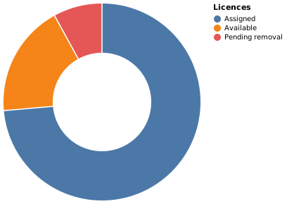
Donut chart (Vega-Lite)

The source, which you can paste into a new diagram and edit:

{
  "$schema": "https://vega.github.io/schema/vega-lite/v5.json",
  "description": "Licences by state",
  "width": 280,
  "height": 280,
  "data": {"values": [
    {"state": "Assigned", "count": 184},
    {"state": "Available", "count": 46},
    {"state": "Pending removal", "count": 20}
  ]},
  "mark": {"type": "arc", "innerRadius": 70, "padAngle": 0.01},
  "encoding": {
    "theta": {"field": "count", "type": "quantitative"},
    "color": {
      "field": "state", "type": "nominal", "title": "Licences",
      "sort": ["Assigned", "Available", "Pending removal"]
    },
    "tooltip": [{"field": "state"}, {"field": "count"}]
  }
}

#Making it your own

  • Set innerRadius to 0 and it is a pie chart.

  • padAngle adds a small gap between slices, which reads better.

  • Three or four slices at most, as with any pie.


A real chart in about ten lines.























