
Sankey diagram
A Sankey diagram encodes quantity in the width of each flow, which makes it unusually good at showing where things go missing: budget, traffic, energy, or users falling out of a funnel.
It is the right chart when the question is not how much, but how much went where.
#When to reach for one
Funnel analysis, where the drop-off is the finding.
Budget and cost allocation across categories.
Energy, material or traffic flows through a system.
#How to draw it in Capable
Route | Use when |
|---|---|
Mermaid | A compact source and value syntax; the quickest route. |
Vega | Full control of colour, ordering and labelling. |
#A worked example
A sign-up funnel, with the losses visible:
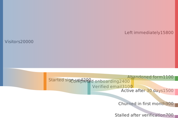
The source, which you can paste into a new diagram and edit:
#A few things that catch people out
Flows must balance. If what leaves a node exceeds what entered, the diagram is wrong.
Name the loss paths explicitly. "Abandoned form" tells you more than a missing arrow.
Keep the number of nodes small; Sankey diagrams get illegible quickly.
#Related
Keep the numbers where people can check them.























