
Pie chart (Mermaid)
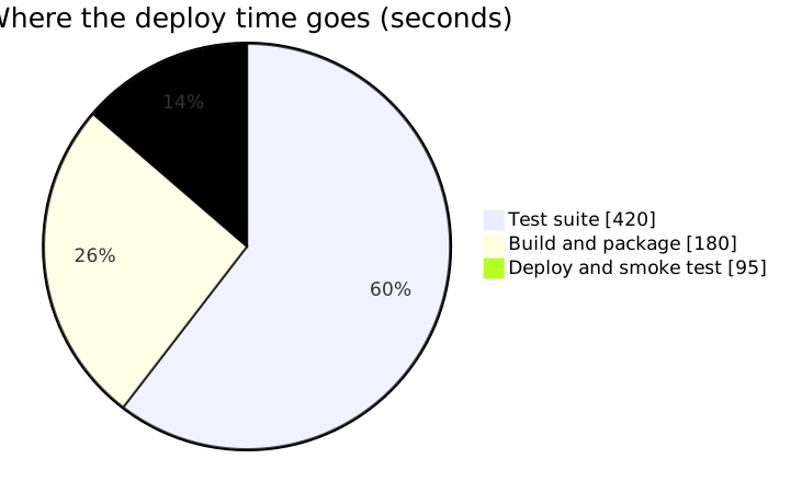
Pie charts stop working somewhere around five slices, because people cannot compare angles. With three parts of a genuine whole, they are fine, and showData puts the numbers on.
#What this example shows
showData, which prints the values rather than making readers estimate.
A title, which a chart without context always needs.
Few enough slices that the comparison is actually possible.
#A worked example
Open it, edit it, or copy the source below.
The source, which you can paste into a new diagram and edit:
#Making it your own
More than five slices means you want a sorted bar chart instead.
The values must sum to something meaningful, or the chart is nonsense.
Order the slices deliberately; arbitrary order makes comparison harder.
#Related
Copy it. Change one line. See what happens.























