
Charts and graphs
Charts in Confluence usually arrive as screenshots of a spreadsheet, which means nobody can check the numbers or change the axis. A chart rendered from a text spec keeps the data visible and editable.
Vega-Lite covers most needs in a few lines; Mermaid handles the simple cases with even less.
#When to reach for one
Reports where the numbers should be reviewable, not just viewable.
Small datasets that live in the document rather than a warehouse.
Anywhere a screenshot of a chart is currently being pasted.
#How to draw it in Capable
Route | Use when |
|---|---|
Vega-Lite | Real charts from a compact spec: bar, line, scatter, area, layered. |
Mermaid | Pie, XY and quadrant charts with minimal syntax. |
Vega | Full control when Vega-Lite is not enough. |
#A worked example
A bar chart, data and all, in one spec:
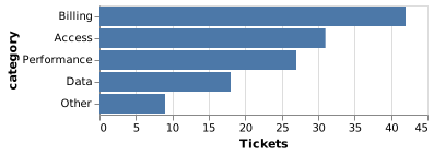
The source, which you can paste into a new diagram and edit:
#Which chart for which question
Question | Chart |
|---|---|
How do these categories compare? | Sorted bar |
How has this changed over time? | Line |
Are these two things related? | Scatter |
How does a total split up? | Stacked bar, or a Sankey for flows |
Where should we focus? | Quadrant |
#A few things that catch people out
The data lives in the spec, so it is a snapshot. Say when it was taken.
Sort categorical bars by value unless the order means something.
Pie charts are hard to read above about five slices. A sorted bar chart is almost always better.
#Related
Keep the numbers where people can check them.























