
Wardley map (Mermaid)
Mermaid has no dedicated Wardley syntax, so this uses a quadrant chart with the two Wardley axes. It is enough to have the argument, which is the point of a Wardley map.
For a full map with dependency lines, draw it on a canvas instead.
#What this example shows
Evolution on the x-axis and visibility to the user on the y-axis.
Quadrants named for the four evolution stages.
Components positioned as an argument to be challenged.
#A worked example
Open it, edit it, or copy the source below.
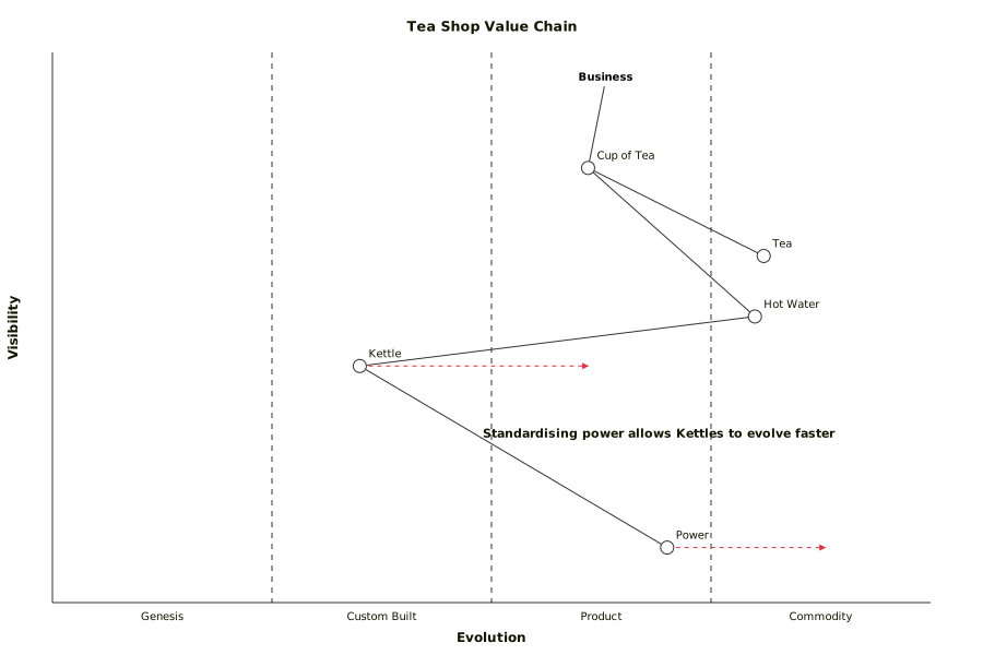
The source, which you can paste into a new diagram and edit:
#Making it your own
Anchor at the user need. A map that starts from your components maps your org chart.
Position is an argument. Record who placed each component and why.
For dependency lines between components, use draw.io.
#Related
Copy it. Change one line. See what happens.























