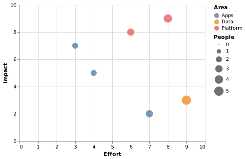
Bubble chart
A bubble chart encodes a third quantitative measure as the area of each point. It is genuinely useful and easily overdone: area is harder to read than position.
Use size for the measure you care about least of the three.
#When this is the right chart
Three measures where two matter more than the third.
Portfolio views: effort, impact and cost.
Comparing items where scale differs enormously.
#What the data needs to look like
#A worked example
Effort, impact and team size in one chart:
The source, which you can paste into a new diagram and edit:
{
  "$schema": "https://vega.github.io/schema/vega-lite/v5.json",
  "description": "Roadmap items: effort, impact and team size",
  "width": 380,
  "height": 280,
  "data": {"values": [
    {"item": "Single sign-on", "effort": 8, "impact": 9, "people": 4, "area": "Platform"},
    {"item": "Bulk export", "effort": 3, "impact": 7, "people": 2, "area": "Apps"},
    {"item": "Dark mode", "effort": 4, "impact": 5, "people": 2, "area": "Apps"},
    {"item": "Audit log", "effort": 6, "impact": 8, "people": 3, "area": "Platform"},
    {"item": "Legacy import", "effort": 9, "impact": 3, "people": 5, "area": "Data"},
    {"item": "Custom themes", "effort": 7, "impact": 2, "people": 3, "area": "Apps"}
  ]},
  "mark": {"type": "circle", "opacity": 0.75},
  "encoding": {
    "x": {"field": "effort", "type": "quantitative", "title": "Effort", "scale": {"domain": [0, 10]}},
    "y": {"field": "impact", "type": "quantitative", "title": "Impact", "scale": {"domain": [0, 10]}},
    "size": {"field": "people", "type": "quantitative", "title": "People"},
    "color": {"field": "area", "type": "nominal", "title": "Area"},
    "tooltip": [{"field": "item"}]
  }
}
#A few things that catch people out
Size is read as area, not radius. Encoding it as radius exaggerates large values fourfold.
Overlapping bubbles need opacity, or the small ones vanish.
Label the bubbles that matter. A legend of eight items is a lookup task.
Pick the chart for the question, not for the look.