
Pie chart
Pie charts work for two or three slices and stop working somewhere around five. People cannot compare angles accurately, which is the whole task a pie chart sets them.
If you need a pie chart, you probably need a sorted bar chart. If the parts genuinely are a whole and there are few of them, this is fine.
#When this is the right chart
Two or three parts of a clear whole.
A single percentage split everyone already understands.
Presentation slides where familiarity beats precision.
#What the data needs to look like
Field | Type |
|---|---|
Label | Nominal: the slice name |
Value | Quantitative: the slice size |
#A worked example
Three slices, which is where a pie chart still works:
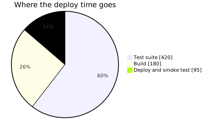
The source, which you can paste into a new diagram and edit:
#A few things that catch people out
Above five slices, use a sorted bar chart. Nobody will thank you for a fifteen-slice pie.
Slices must sum to a meaningful whole. A pie of unrelated numbers is meaningless.
Include the values, not only the shapes. Reading angles is guesswork.
#Related
Pick the chart for the question, not for the look.























