
Line chart
Line charts are for time. The connecting line implies continuity, which is exactly why they are wrong for categories: connecting Billing to Access implies something that is not true.
Multiple series are fine, up to about five. Beyond that use small multiples.
#When this is the right chart
Trends over time.
Comparing a few series on the same scale.
Before and after, where the shape of the change matters.
#What the data needs to look like
Field | Type |
|---|---|
Time | Temporal: a date or timestamp |
Value | Quantitative |
Series | Nominal, optional: one line each |
#A worked example
Two series over eight weeks:
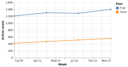
The source, which you can paste into a new diagram and edit:
#A few things that catch people out
Set the field type to temporal, or dates are treated as unordered categories.
Do not connect categories with a line. That is a bar chart wearing a disguise.
Label the series directly if you can; legends cost the reader a lookup.
#Related
Pick the chart for the question, not for the look.























