
Donut chart
A donut chart is a pie chart with a hole, and the hole is useful: it gives you somewhere to put the total, which is often the number the reader actually wants.
Every limitation of a pie chart applies. The hole does not fix the angle-reading problem.
#When this is the right chart
Part-to-whole with a total worth showing in the middle.
Dashboards where the shape is a familiar visual anchor.
The same two or three categories a pie would handle.
#What the data needs to look like
Field | Type |
|---|---|
Label | Nominal |
Value | Quantitative |
Inner radius | Set on the mark to make it a donut |
#A worked example
A donut, with the inner radius doing the work:
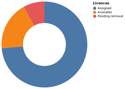
The source, which you can paste into a new diagram and edit:
#A few things that catch people out
The hole is for the total. Leaving it empty wastes the only advantage over a pie.
Three or four categories at most.
Order the slices deliberately; arbitrary order makes comparison harder still.
#Related
Pick the chart for the question, not for the look.























