
Quadrant chart (Mermaid)
A quadrant chart is a way of forcing a prioritisation conversation. Naming the quadrants is what turns it from a scatter plot into an argument.
#What this example shows
Named quadrants, so nobody reads their own meaning into the corners.
Axis labels that state the direction of each scale.
Points positioned from 0 to 1 on both axes.
#A worked example
Open it, edit it, or copy the source below.
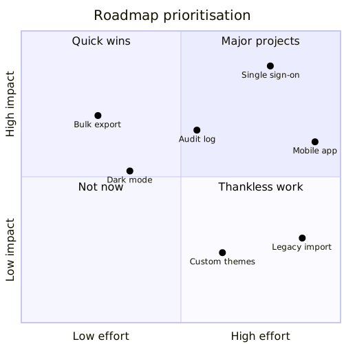
The source, which you can paste into a new diagram and edit:
#Making it your own
Positions are opinions. Record who placed them and revisit afterwards.
Rename the quadrants to suit your own framing; the defaults rarely fit.
Two axes only. A third dimension needs a bubble chart.
#Related
Copy it. Change one line. See what happens.























