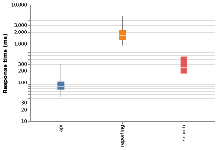
Box diagram (Vega-Lite)
A box plot compresses a distribution into five numbers and shows outliers separately. It is the honest alternative to comparing averages.
#What this example shows
The boxplot mark, which does the statistics for you.
An explicit extent, so the whiskers mean something stated.
A log scale, because latency spans orders of magnitude.
#A worked example
Open it, edit it, or copy the source below.
The source, which you can paste into a new diagram and edit:
{
  "$schema": "https://vega.github.io/schema/vega-lite/v5.json",
  "description": "Response time distribution by service",
  "width": 380,
  "height": 240,
  "data": {"values": [
    {"service": "api", "ms": 42}, {"service": "api", "ms": 61}, {"service": "api", "ms": 70},
    {"service": "api", "ms": 78}, {"service": "api", "ms": 96}, {"service": "api", "ms": 118},
    {"service": "api", "ms": 310},
    {"service": "search", "ms": 120}, {"service": "search", "ms": 160}, {"service": "search", "ms": 180},
    {"service": "search", "ms": 240}, {"service": "search", "ms": 320}, {"service": "search", "ms": 610},
    {"service": "search", "ms": 980},
    {"service": "reporting", "ms": 900}, {"service": "reporting", "ms": 1200}, {"service": "reporting", "ms": 1400},
    {"service": "reporting", "ms": 1800}, {"service": "reporting", "ms": 2400}, {"service": "reporting", "ms": 5200}
  ]},
  "mark": {"type": "boxplot", "extent": "min-max"},
  "encoding": {
    "x": {"field": "service", "type": "nominal", "title": null},
    "y": {"field": "ms", "type": "quantitative", "title": "Response time (ms)", "scale": {"type": "log"}},
    "color": {"field": "service", "type": "nominal", "legend": null}
  }
}
#Making it your own
State what the whiskers mean. min-max and 1.5 times the IQR are both common and different.
Box plots hide bimodal distributions; pair with a histogram if you suspect one.
With five data points per group, plot the points instead.
A real chart in about ten lines.