
Heat map
A heat map puts categories on both axes and encodes a value as colour. It is very good at showing where something concentrates, and only as good as its colour scale.
Sequential data needs a sequential scale; data with a meaningful midpoint needs a diverging one.
#When this is the right chart
Activity by day and hour.
Coverage or risk matrices across two dimensions.
Any table of numbers whose pattern matters more than its values.
#What the data needs to look like
Field | Type |
|---|---|
Row | Nominal |
Column | Nominal or ordinal |
Value | Quantitative: the colour |
#A worked example
Deployments by day and hour:
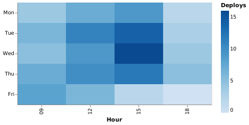
The source, which you can paste into a new diagram and edit:
#A few things that catch people out
Choose the colour scheme deliberately. A rainbow scale invents boundaries that are not in the data.
Sort the axes meaningfully; alphabetical days of the week are a common accident.
Include the numbers as a tooltip or as text if precision matters.
#Related
Pick the chart for the question, not for the look.























