
Component diagram (PlantUML)
What makes this a component diagram rather than a box diagram is the interfaces: what each component offers, and what it needs.
#What this example shows
Provided interfaces drawn as lollipops.
Packages grouping related components.
External systems drawn outside the boundary.
#A worked example
Open it, edit it, or copy the source below.
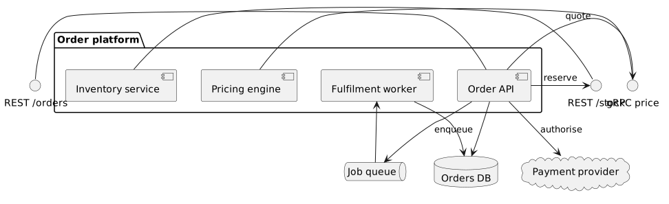
The source, which you can paste into a new diagram and edit:
#Making it your own
Use interface plus a dash to attach a lollipop to a component.
database, queue and cloud are shapes worth using; they carry meaning at a glance.
Keep deployment out of it. That belongs on a deployment diagram.
#Related
Verbose, stable, and it draws almost everything.























