
Deployment diagram
Deployment diagrams map software onto infrastructure: which artefact runs on which node, and what the nodes are. They answer questions component diagrams cannot.
Useful whenever "where does this actually run?" has taken more than one message to answer.
#When to draw one
Documenting an environment for people who will operate it.
Comparing environments where they genuinely differ.
Capacity and resilience discussions.
#What is on the diagram
Element | Meaning |
|---|---|
Node | A device or execution environment: a server, a container host |
Artifact | A deployable thing: a jar, an image, a bundle |
Execution environment | A runtime inside a node: a JVM, a container runtime |
Communication path | A line between nodes, labelled with the protocol |
#A worked example
Artefacts placed on nodes, with protocols on the links:
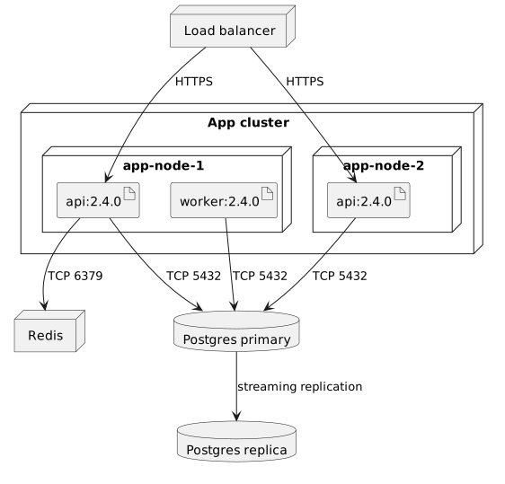
The source, which you can paste into a new diagram and edit:
#A few things that catch people out
Put versions on artefacts. A deployment diagram without them describes an aspiration.
Label the protocol and port on communication paths; that is what firewall reviews need.
One diagram per environment, or one diagram with the differences annotated.
#Related
Four types cover most of it.























