
Area chart

An area chart is a line chart with the region beneath it filled, which reads as a magnitude rather than a rate. Stacked, it shows how a total is composed over time.

The trap is that only the bottom band has a flat baseline, so every band above it is hard to read individually.


#When this is the right chart

  • Cumulative totals over time.

  • Composition of a total, when the total matters more than the parts.

  • Volume, where the filled area conveys quantity.


#What the data needs to look like

Field

Type

Time

Temporal

Value

Quantitative

Series

Nominal, for stacking


#A worked example

A stacked area chart of storage growth:
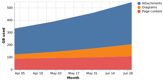
Area chart

The source, which you can paste into a new diagram and edit:

{
  "$schema": "https://vega.github.io/schema/vega-lite/v5.json",
  "description": "Storage used by content type",
  "width": 380,
  "height": 220,
  "data": {"values": [
    {"month": "2026-04-01", "kind": "Attachments", "gb": 210},
    {"month": "2026-05-01", "kind": "Attachments", "gb": 246},
    {"month": "2026-06-01", "kind": "Attachments", "gb": 289},
    {"month": "2026-07-01", "kind": "Attachments", "gb": 341},
    {"month": "2026-04-01", "kind": "Diagrams", "gb": 34},
    {"month": "2026-05-01", "kind": "Diagrams", "gb": 48},
    {"month": "2026-06-01", "kind": "Diagrams", "gb": 71},
    {"month": "2026-07-01", "kind": "Diagrams", "gb": 96},
    {"month": "2026-04-01", "kind": "Page content", "gb": 88},
    {"month": "2026-05-01", "kind": "Page content", "gb": 94},
    {"month": "2026-06-01", "kind": "Page content", "gb": 99},
    {"month": "2026-07-01", "kind": "Page content", "gb": 108}
  ]},
  "mark": "area",
  "encoding": {
    "x": {"field": "month", "type": "temporal", "title": "Month"},
    "y": {"field": "gb", "type": "quantitative", "title": "GB used", "stack": "zero"},
    "color": {"field": "kind", "type": "nominal", "title": null}
  }
}

#A few things that catch people out

  • Put the most important series at the bottom; it is the only one with a flat baseline.

  • If readers need to compare individual series, use lines instead.

  • Do not stack values that are not additive. Percentages of different totals are not.


Pick the chart for the question, not for the look.























