
Vega-Lite
Vega-Lite is the practical way to put a chart on a Confluence page. Give it data, a mark type and an encoding, and it handles scales, axes and legends.
It is the first thing to try whenever somebody is about to paste a screenshot of a spreadsheet chart.
#What it is good at
Bar, line, area, scatter and layered charts.
Small datasets that belong in the document.
Reports where the numbers should be reviewable.
#What it draws
Diagram | Syntax starts with |
|---|---|
Mark | "mark": "bar" | "line" | "point" | "area" |
Encoding | "encoding": {"x": {...}, "y": {...}, "color": {...}} |
Field types | nominal, ordinal, quantitative, temporal |
Layering | "layer": [ ... ] for combined charts |
#A worked example
A line chart with a colour series:
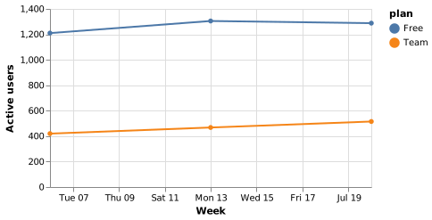
The source, which you can paste into a new diagram and edit:
#A few things that catch people out
Field type matters: temporal gives you a date axis, nominal gives you categories.
The data is a snapshot embedded in the page. For live data, link to a dashboard.
If a spec gets long and fiddly, that is the signal to move to Vega.
#Related
Learn one properly. Borrow the rest when you need them.






















