Calendar
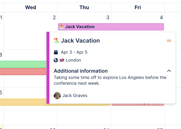
Renders a Calendar grid of the dates on the page, or of a saved Capable calendar, in one of five views. Events show as coloured cards with the title in bold, an avatar stack of participants, and a split/check icon for decision and task items; hovering opens a hover card with the detail. Events b
#Settings
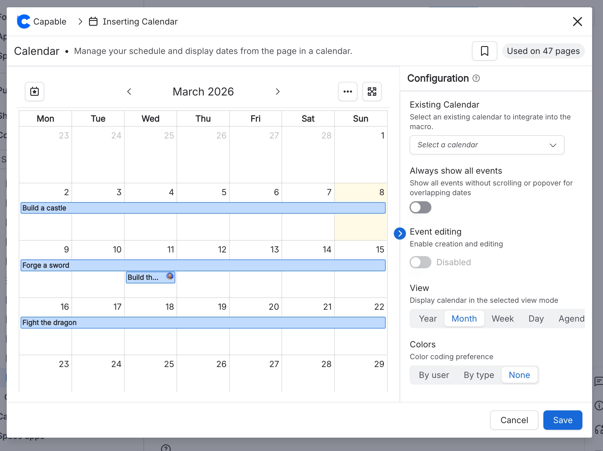
Setting | Values | What it changes |
|---|---|---|
Source | A saved Capable calendar (space-scoped or global), or unset | Leave unset to show the dates already on this page, or pick a saved calendar. The picker also offers "Create new calendar". Hint text: "Leave unset to show the dates already on this page, or pick a saved calendar.". |
Event editing | on / off | "Let readers create and edit events from the macro." Only appears when a saved calendar is selected; clearing the calendar forces it back off. |
View | Year, Month, Week, Day, Agenda | Which grid the macro renders. Month is a day grid, Week and Day are time grids, Year is a twelve-month overview, Agenda is a week-long chronological list. |
Start on | Last event, Today, Custom | Which period the calendar opens on. Hints shown under the control: "Opens on the most recent event, or the next upcoming one if none have passed." / "Always opens on today's date, even when the nearest events are months away." / "Always ope |
Start date | A date (YYYY-MM-DD) | Only read when Start on is Custom; the date input only appears once Custom is selected. It must be a complete, real date. It is read as a local date so the calendar does not open a day early west of Greenwich. Anything unreadable falls back |
Always show all events | on / off | "Show every event on a busy day instead of collapsing the extras into a popover." Off means busy days show a "+N more" link. |
Colours | By user, By type, None | "How events are colour-coded on the grid." An event's own colour, or the colour of a matching calendar tag, always wins over this setting. Colour order of precedence: the event's own colour, then the highest-priority matching tag's colour, |
Height | 400 to 1000 px, slider step 50 | Fixed pixel height of the grid. Stored values outside the range are clamped to 400 or 1000. |
Event types | Capable Event macros / Confluence Date macros / In-Calendar | "Which sources of dates are drawn. With none selected, all of them are." Tooltips: "Capable Event macros inserted on pages", "Confluence Date macros inserted on pages", "Events created in a saved Capable Calendar". |
Hidden on-page events | A list of dates found on the page, chosen by clicking chips | "Pick dates from this page to leave off the grid." Only affects dates found on the current page. |
Corner radius | 0 to 24 px | Outer container corner radius. Invisible until a border or shadow frames the calendar. |
Shadow | None, S, M, L | Resting drop shadow on the container. None reproduces the frameless original look. |
Border | On / off, plus Width 0 to 6 px and a colour | Optional container outline. Width and colour only appear once Border is on. |
Highlight colour | A brand colour or a custom hex; clearable | "Tints today & selected dates. Leave unset to use the theme accent. Your event colours are unaffected.". |
Display | Dates-on-this-page (the only value) | Not something you can set in the editor. |
Options (participant avatars) | Show-users (the only value) | Controls whether participant avatars appear on event cards. |
#Related
One macro, documented properly.