
Theming your site
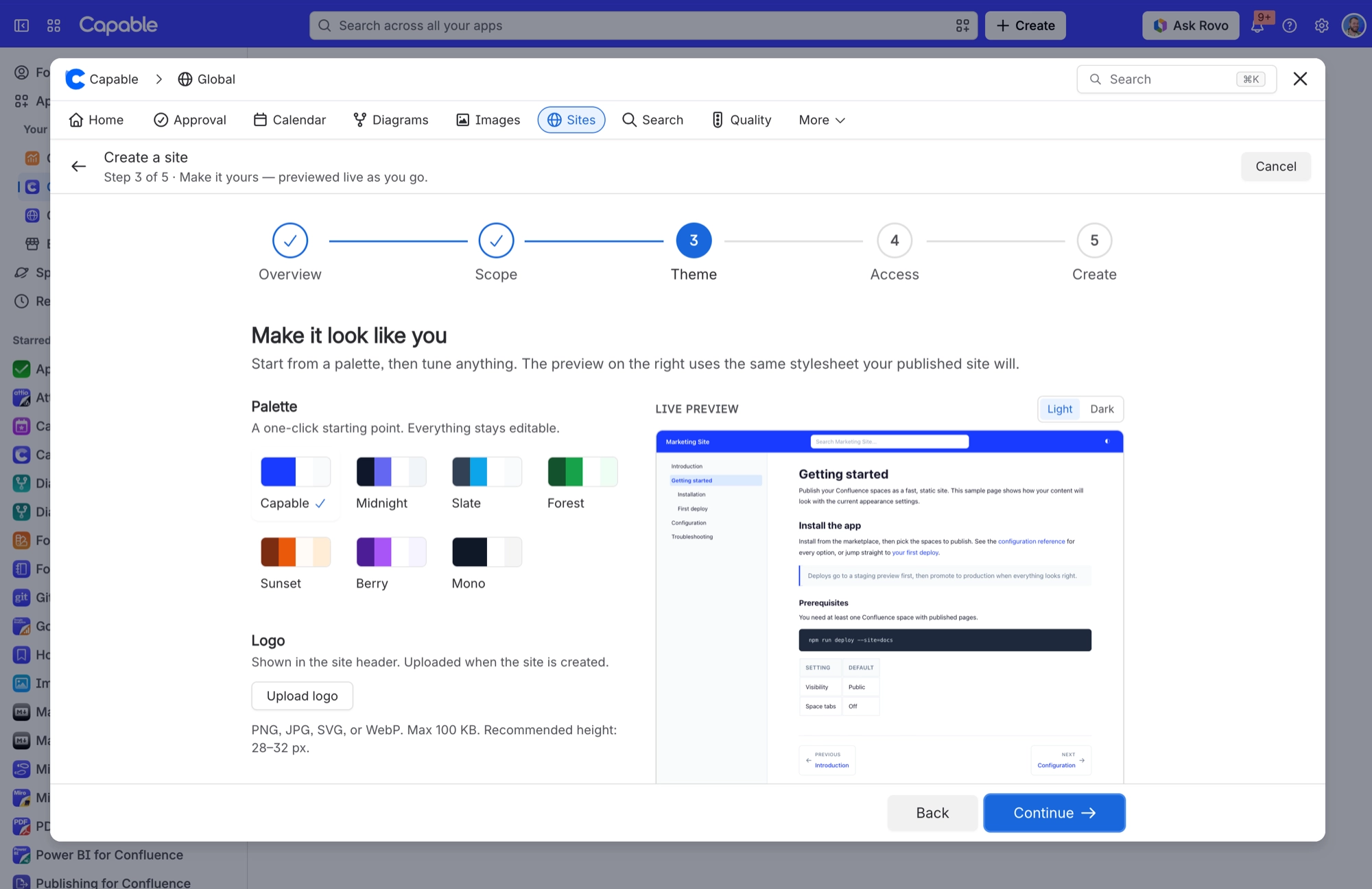
Theming starts from one of seven palettes and then lets you change everything. Colours are checked for contrast as you type, with a plain-English message rather than a number.
Dark mode is not something you configure. Every published page carries a toggle, and your colours are adapted rather than inverted.
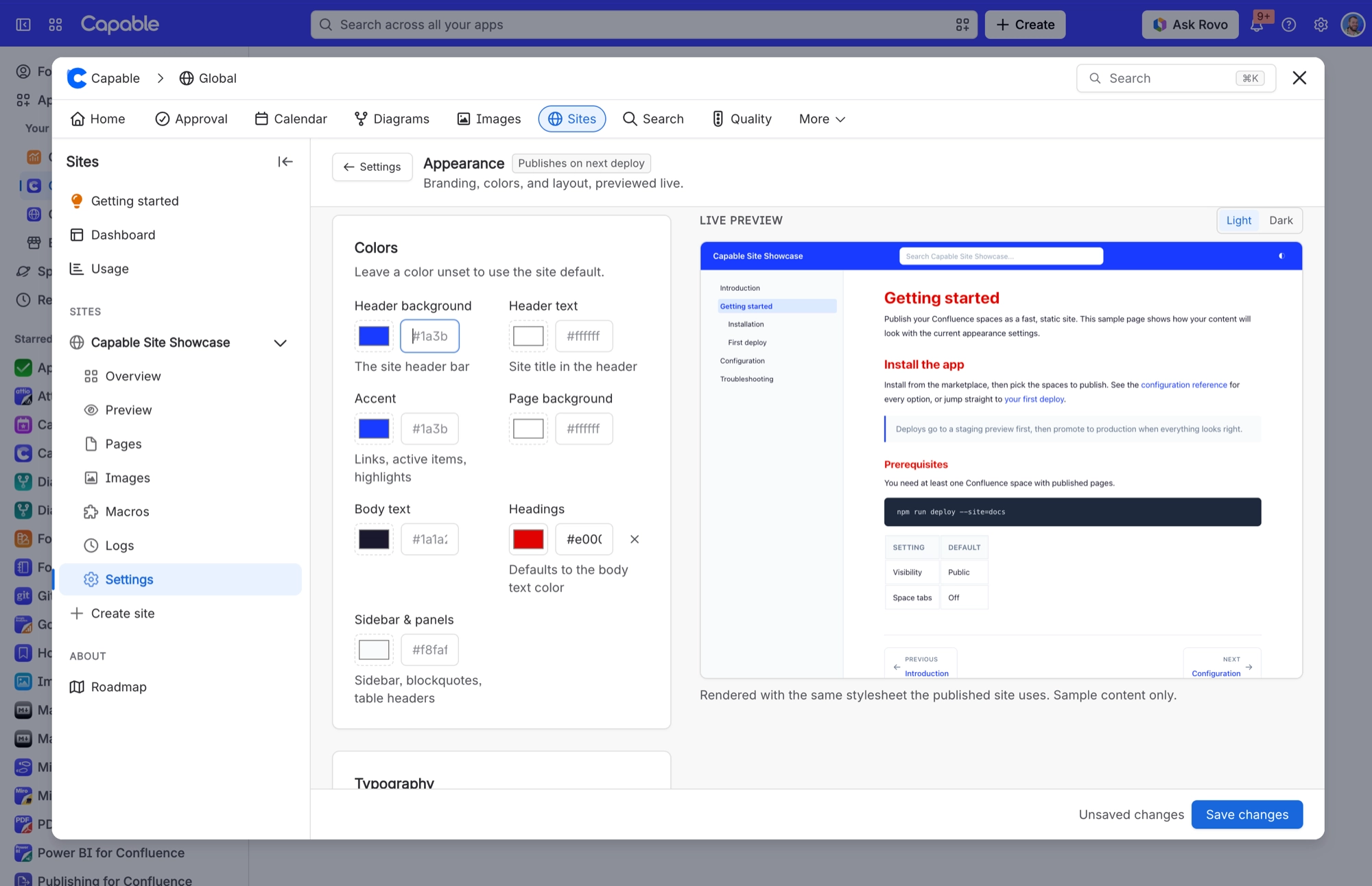
You pick a palette in the Theme step when you create a site. After that, every control lives in the site's Settings under Appearance, with a live preview you can flip between light and dark. Changes publish with your next deploy.
#Every control
#Colours
Control | What it does |
|---|---|
Palette presets | One-click starting palettes in the Theme step when you create a site. Each fills the seven colour fields, and everything stays editable afterwards. Choosing "Capable" resets every colour to the default. |
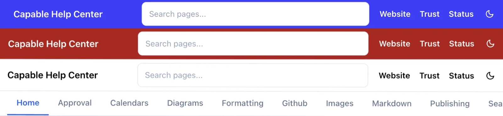
Header background | The site header bar. The header is treated as a brand bar, so it keeps your colours in both light and dark mode, whichever the visitor is using. |
Header text | Site title and header controls. Graded for contrast against the header background. |
Accent | Links, active items and highlights. Also tints hover states and the active sidebar row. Automatically lightened for dark mode so it stays legible. |
Page background | The article canvas. If you pick a dark value it is kept as-is in dark mode. |
Body text | Article body copy. |
Headings | All heading levels inside the article. |
Sidebar & panels | Sidebar background, blockquotes and table headers. In dark mode a light value here becomes a slightly raised dark surface, rather than glaring white. |
Contrast grading | Every colour you set is checked for legibility as you type, with a plain-English message per field, for example "Links reach only 3.8:1 against the sidebar, below the 4.5:1 accessibility minimum. Try a darker accent." Fields you leave blank use the site default. |
Dark mode | Every published page carries a dark-mode toggle in the header. The choice is remembered per browser and applied as the page loads, so there is no flash of the wrong colours. Visitors whose device is set to prefer dark get the dark palette automatically. Your colours are adapted for dark mode rather than inverted. |
Contrast grading is the useful part. Each colour is graded as you set it, so you find out that links only reach 3.8:1 against the sidebar while you can still do something about it.
#Logo, icons and type
Control | What it does |
|---|---|
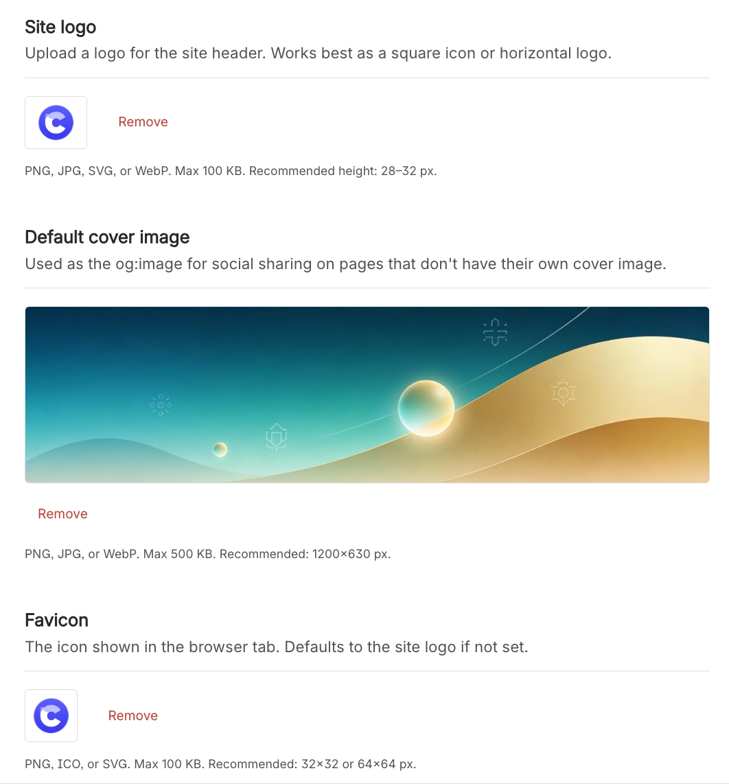
Site logo | Shown at the left of the site header, linking to the site home. Without one, the header shows the site title as text. |
Favicon | The browser-tab icon. If you don't set one, the site logo is used. |
Default cover image | The social sharing image used for any page that has no cover image of its own. |
Font family | Body text and headings together. Inter, Source Sans and Pagella load a web font from Capable's servers. The rest use fonts already installed on the visitor's device, so nothing extra downloads. |
#Header, banner and footer
Control | What it does |
|---|---|
Header links | External links on the right of the site header. They always open in a new tab, and are hidden on screens narrower than 960px. |
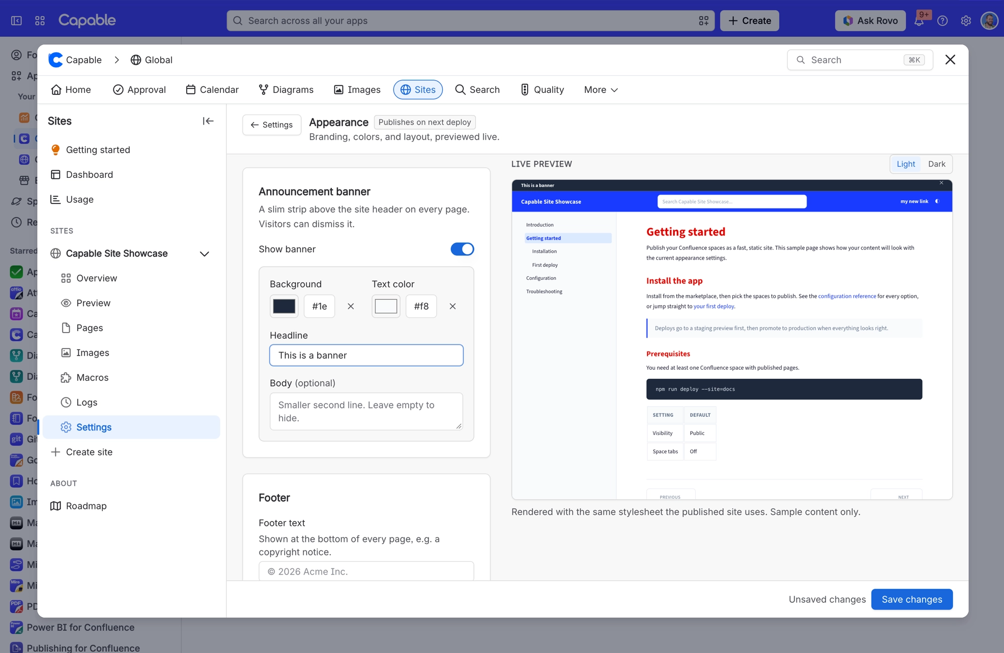
Announcement banner | A slim strip above the site header on every page, with its own background and text colour, a headline and an optional second line. Visitors can dismiss it, and editing the wording or colours makes it reappear for everyone. |
Footer text | A line at the bottom of every page, above the fixed "Created with Capable Sites + Atlassian Confluence" credit. |
#Under the page title
Control | What it does |
|---|---|
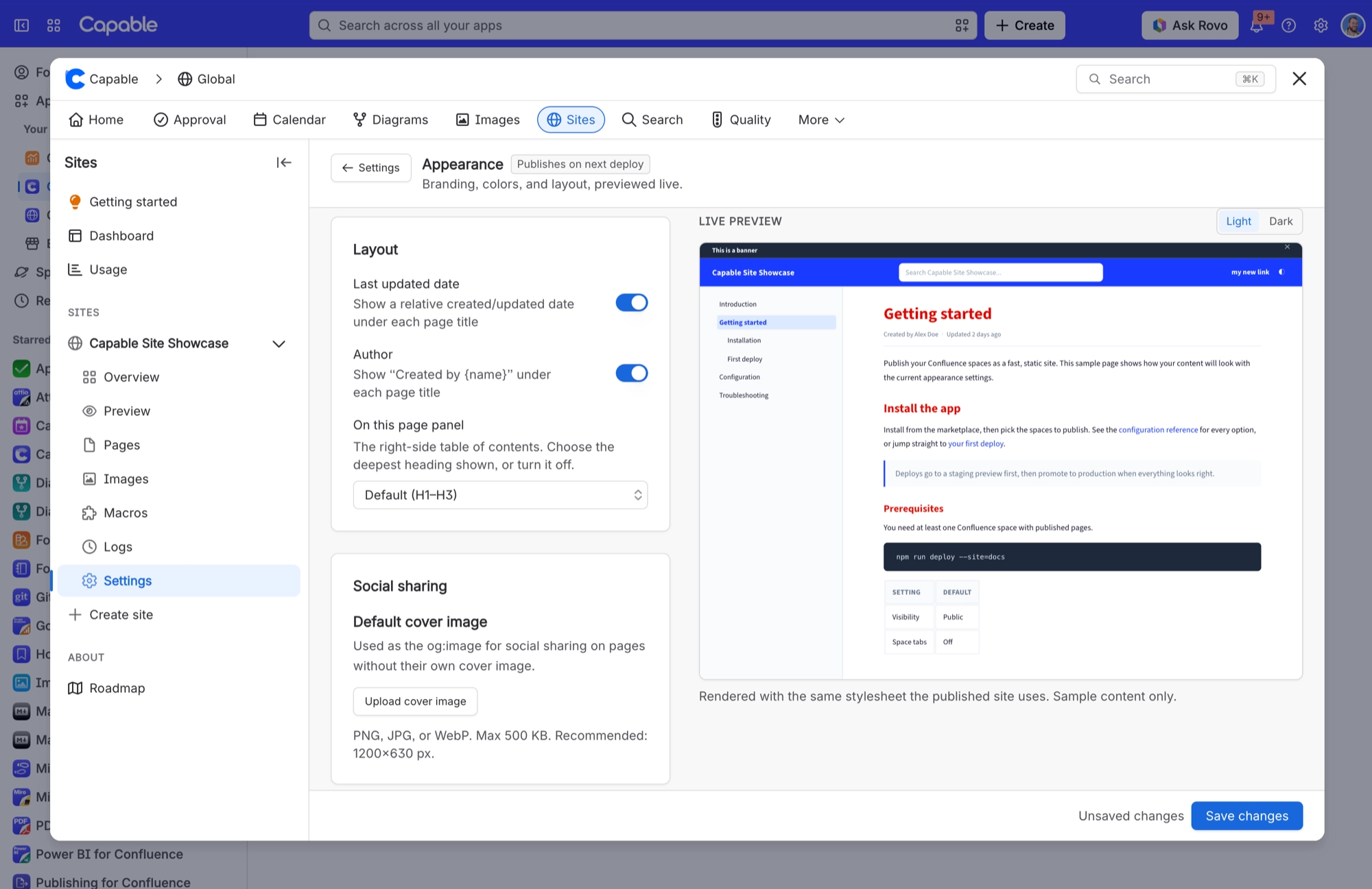
Last updated date | A relative date under each page title ("3 days ago") with the exact date on hover. Labelled "Created" on a page's first version and "Updated" after that. |
Author | Shows "Created by {name}" under each page title. |
On this page panel | The right-hand table of contents. Pick the deepest heading level shown, or turn it off. It is hidden automatically on screens narrower than 1200px, whatever this setting says. |
#Fixed layout
Control | What it does |
|---|---|
Layout dimensions | Fixed. The sidebar is 280px wide (flexing between 18% of the window width and 380px), "On this page" is 220px (up to 300px), the header is 56px tall and the article column is at most 820px wide. |
Responsive breakpoints | Below 1200px, "On this page" disappears. Below 960px, header links go. Below 840px, the space switcher loses its text label. Below 780px, the search box, header links and header switcher all disappear, and the sidebar folds into a menu button. |
#Dark mode
Visitors get a toggle in the header. Their choice is remembered per browser and applied as the page loads, so there is no flash. Your header colours are kept in both modes because the header is treated as a brand bar. There is no way to turn dark mode off.
#A few things worth knowing
Three of the font choices load a web font from our servers. The rest use fonts already on the visitor's device.
Layout dimensions are fixed, and several elements hide themselves below set screen widths.
A number of theme values have no field in the app, so you can't change them. See What is not configurable.
#Related
Pick a palette. Change everything.






















