Tabs
A tabbed container: you write page content inside it, and each Tab macro you place starts a new tab.
Reach for this when one page has to serve several audiences or several stages, Overview / Setup / Troubleshooting, or one tab per environment, and you would rather not make the reader scroll past the parts that are not theirs. You place the Tabs macro on the page, then inside its body you place a Tab macro to name each tab and write the tab's content underneath it. Anything is allowed inside a tab: text, tables, images, other macros. The tab strip itself is fully styleable, four header looks, three sizes, brand colours for the active and inactive tabs, and an optional bordered container around the whole thing.
#See it
Every example below is a real macro on this page, not a screenshot, and each one is a configuration taken from a page somebody actually built. Open this page in the editor to see how any of them is set up.
#Solid, vertical, left
This is tab 1
This is tab 2
This is tab 3
#Solid, horizontal, left
Welcome aboard!
You can include formatting, tables and images, panels etc.
Here is a panel
Table | Table | Table |
|---|---|---|
This is some more text
This is some cards - we are working to align the styling.


You can include macros like diagrams within tabs.
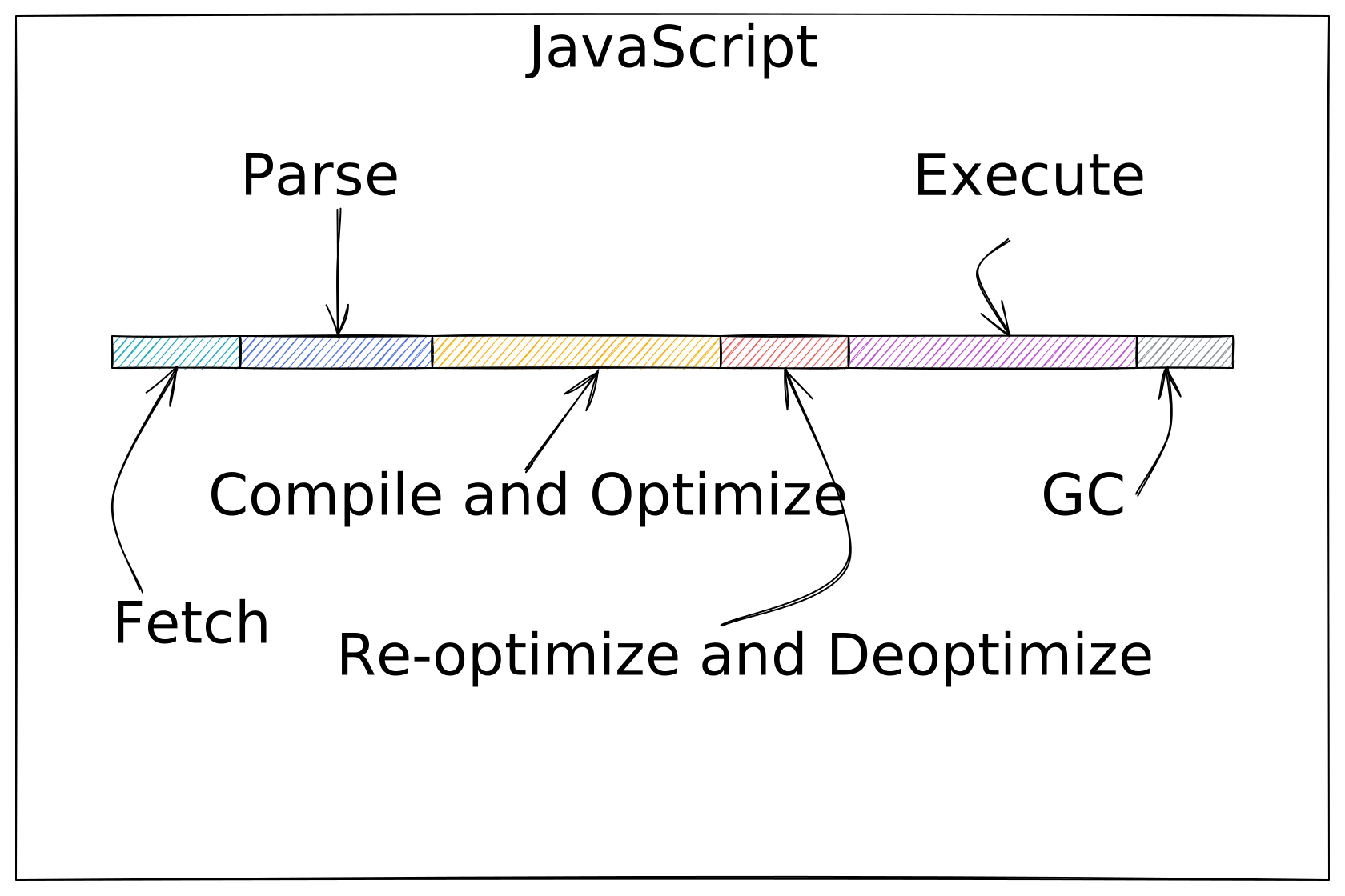
We’re a small, cross‑functional team focused on making complex tasks simple. Our aim is to deliver clear, reliable solutions that help people get work done with confidence.
This is a tab with some text inside it.
#Solid, horizontal, left (2)
This is tab 1
This is tab 2
This is tab 3
#Settings
Setting | Values | What it changes |
|---|---|---|
Tabs Alignment | left, center, right | Where the tab strip sits above the panel. Called "Align Tabs" in the underlying schema. |
Show Container | On / Off | Draws a border around the whole tab group. |
Tabs Orientation | Horizontal, Vertical | Horizontal puts the tab strip above the content; Vertical puts it in a sidebar down the left, at least 200px tall. |
Tab style | Underline, Pills, Enclosed, Solid | How the tab headers are drawn. Solid fills the active tab with a colour block and bolds it; Pills is a segmented control; Underline is a flat strip with an accent underline; Enclosed gives the active tab a folder-tab outline. Call |
Tab size | Small, Medium, Large | Padding and font size of the tab headers. Called "Tab Size" in the underlying schema. |
Active | A brand-palette colour or custom hex; empty = theme colour | Colour of the selected tab. For Underline and Enclosed this is the text and underline colour; for Solid it is the LABEL colour sitting on the fill. Called "Active Tab Colour" in the underlying schema. |
Inactive | A brand-palette colour or custom hex; empty = theme colour | Colour of the tabs that are not selected. Called "Inactive Tab Colour" in the underlying schema. |
Tab background | A brand-palette colour or custom hex; empty = theme highlight | Fills the selected tab. Used most by the Solid style; on the other styles it tints the active tab. |
Tab corner radius | 0 to 24 (px slider) | Rounds the individual tab headers. Called "Tab Corner Radius" in the underlying schema. |
Corner radius | 0 to 24 (px slider) | Rounds the outer container. Only visible when Show Container is on. Called "Container Corner Radius" in the underlying schema, and it sits in a "Container" section of the Style tab. |
Border colour | A brand-palette colour or custom hex; empty = theme border | Colour of the container border. Only visible when Show Container is on. Called "Container Border Colour" in the underlying schema. |
#Related
The two most used macros here.