Countdown
A live timer counting down to - or up from - a date and time, in one of four visual styles.
Use this to put a deadline on a page and have it stay honest: days until a launch, hours until a sprint ends, or time elapsed since an incident started (count-up mode). It ticks every second in the reader's browser rather than showing a stale number. Four styles cover different tones - chunky Tiles for a landing page, a green-on-black Digital clock for a war room, Progress rings for something decorative, and Plain text when it just needs to sit quietly. You choose which units it shows, so a six-month countdown can show days only instead of a distracting seconds counter.
#See it
Every example below is a real macro on this page, not a screenshot, and each one is a configuration taken from a page somebody actually built. Open this page in the editor to see how any of them is set up.
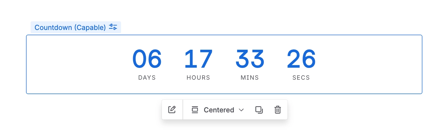
#Digital, countdown, medium: Sprint ends in
#Rings, countdown, large: Launch day
#Tiles, countup, medium: Days since go-live
#Settings
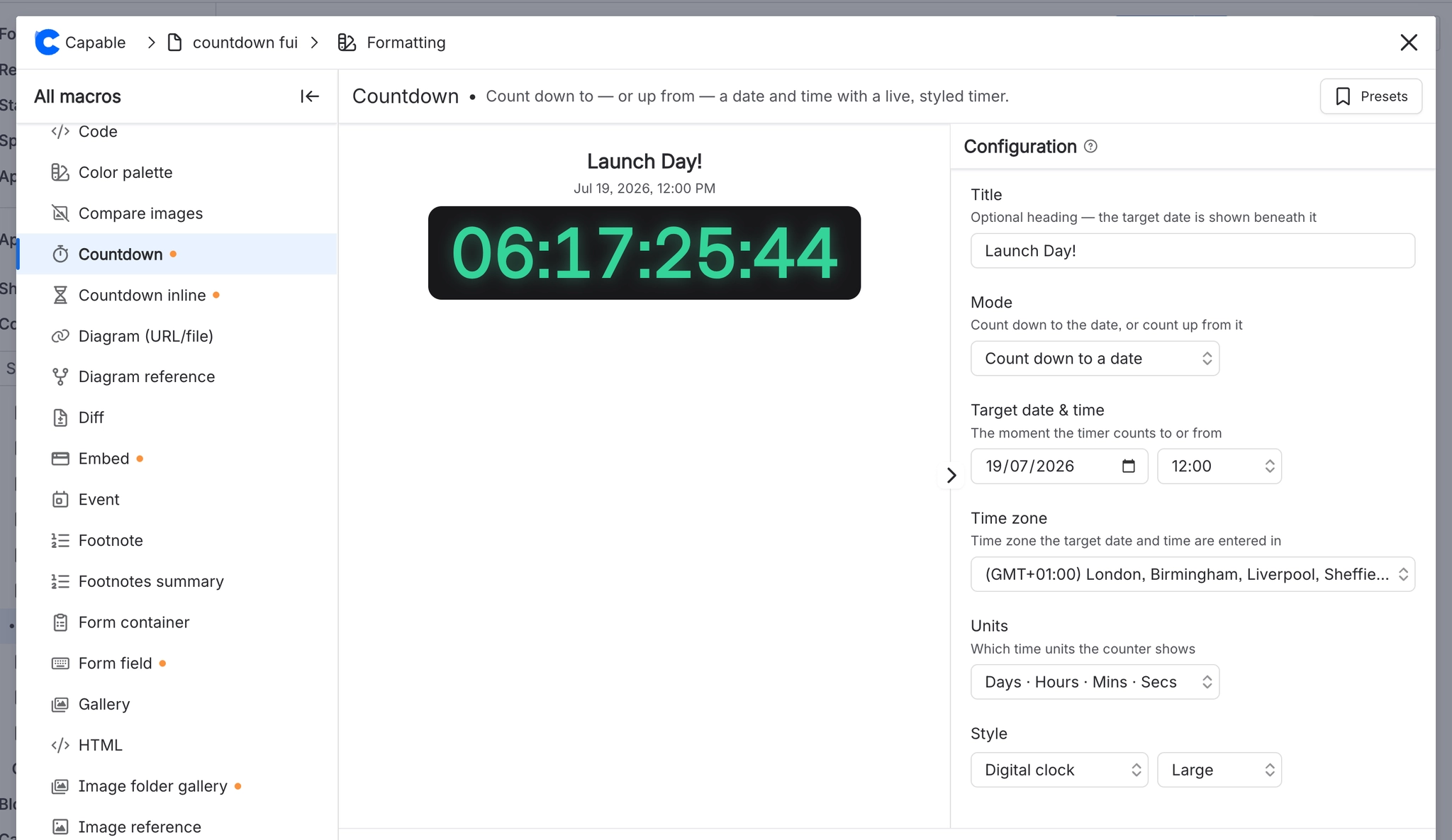
Setting | Values | What it changes |
|---|---|---|
Title | Free text, up to 75 characters | An optional heading above the counter. When set, the resolved target date and time is printed beneath it in the reader's own locale. Panel description: "Optional heading - the target date is shown beneath it". |
Mode | "Count down to a date" (countdown) / "Count up from a date" (countup) | Whether the timer runs toward the target or away from it. |
Target date & time / Start date & time | A date, plus a time chosen from 48 half-hour slots (00:00 to 23:30) | The instant the timer counts to or from. The field's heading changes to "Start date & time" in count-up mode. Panel description: "The moment the timer counts to or from". |
Time zone | Any IANA zone, searchable, with "My timezone" pinned at the top | Which zone the date and time above are entered in. Panel description: "Time zone the target date and time are entered in". See the caveat - opening the config panel changes this. |
Units | Days · Hours · Mins · Secs / Days · Hours · Mins / Days only / Hours · Mins · Secs / Hours · Mins / Hours only | Which time units the counter shows, largest first. Panel description: "Which time units the counter shows". |
Message when finished | Free text | Replaces the counter entirely once a countdown reaches zero. Panel description: "Replaces the counter once a countdown reaches zero". |
Style | Tiles / Digital clock / Progress rings / Plain text | The look of the counter. Tiles = one boxed number per unit. Digital clock = a single colon-separated readout on a dark slab with a glow. Progress rings = one circular gauge per unit. Plain text = a bare line like "3d 4h 12m 5s". |
Size | Small / Medium / Large | Scales type, padding, tile width and ring diameter together (rings are 52 / 76 / 104 px). |
Accent | Brand palette colour, custom colour, or cleared | Colour of the numbers, the ring fill, the plain-text line and the finished message. Panel hint: "Leave empty to use the theme accent colour." In Digital style specifically, an empty accent falls back to #34d399 green, and the acce |
Position | Left / Center / Right | Horizontal alignment of the whole block within the column. |
Show unit labels | On / Off | Whether "DAYS", "HOURS" etc. print under each number. In Plain text style it instead switches the readout between "3d 4h 12m 5s" (on) and "03:04:12:05" (off). |
Show border | On / Off | Draws a border around the tiles, the digital slab, or the plain-text line. |
Background | Brand palette colour, custom colour, or cleared | Overrides the surface colour behind the counter. Panel hint: "Overrides the counter's built-in surface colour." |
Labels | Brand palette colour, custom colour, or cleared | Colour of the unit labels under each number. Panel hint: "Colour of the unit labels." |
Border colour | Brand palette colour, custom colour, or cleared | Colour of the border. Only shown in the panel when "Show border" is on. |
#Related
These carry state. Keep them true.