Color palette
Publishes a named set of colours as a click-to-copy swatch bar or a Name / Colour / Code table.
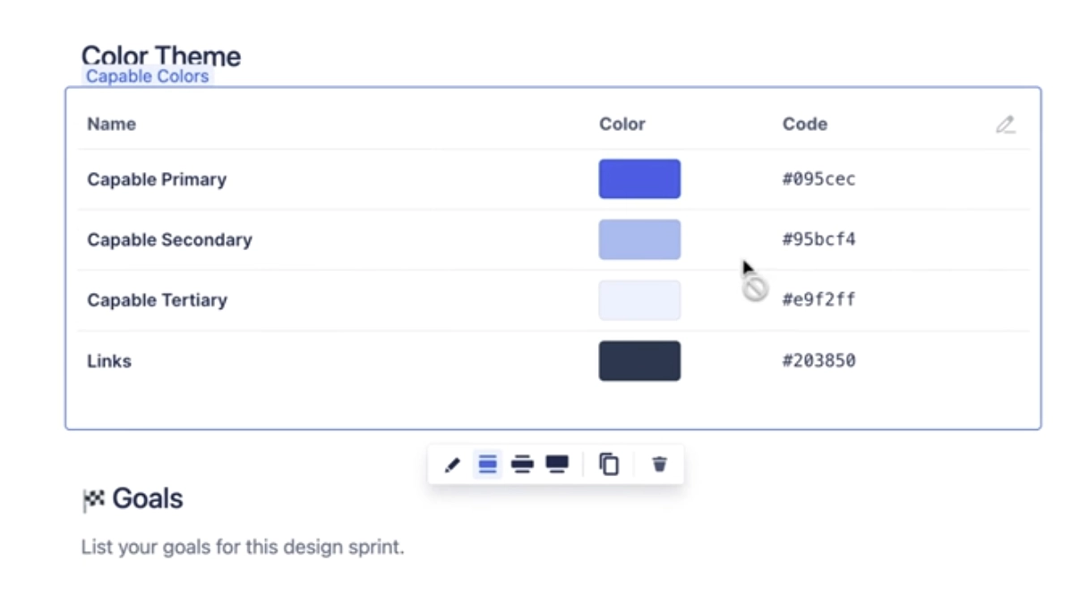
Design systems, brand pages and style guides need the hex values written down somewhere people can grab them. This macro holds a list of named colours and renders them either as a solid segmented bar that expands the swatch you hover, or as a table with the name, a swatch and the hex code. Every swatch is click-to-copy: readers click and the hex lands on their clipboard with a confirmation toast. You can build the list by hand, seed it in one click from your organisation's brand colours, or describe the palette you want and let AI generate it. Three starter templates (Brand swatches, Design tokens, Contrast pair) are offered when you insert a new one.
#See it
Every example below is a real macro on this page, not a screenshot, and each one is a configuration taken from a page somebody actually built. Open this page in the editor to see how any of them is set up.
#9 colours, table: Deep Sea Blue
| Name | Color | Code |
|---|---|---|
| Deep Sea Blue | #003B5C |
|
| Coral Reef | #FF6F61 |
|
| Aqua Wave | #00B2A9 |
|
| Sandy Beach | #F4D03F |
|
| Sunset Glow | #FF8C42 |
|
| Seafoam Green | #A8E6CE |
|
| Ocean Mist | #B2E0E0 |
|
| Shell Pink | #FAD3D3 |
|
| Stormy Sky | #7D9EC0 |
#3 colours, table: Primary
| Name | Color | Code |
|---|---|---|
| Primary | #172b4d |
|
| Secondary | #0c66e4 |
|
| Tertiary | #e9f2ff |
#3 colours, box: Primary

#Settings
Setting | Values | What it changes |
|---|---|---|
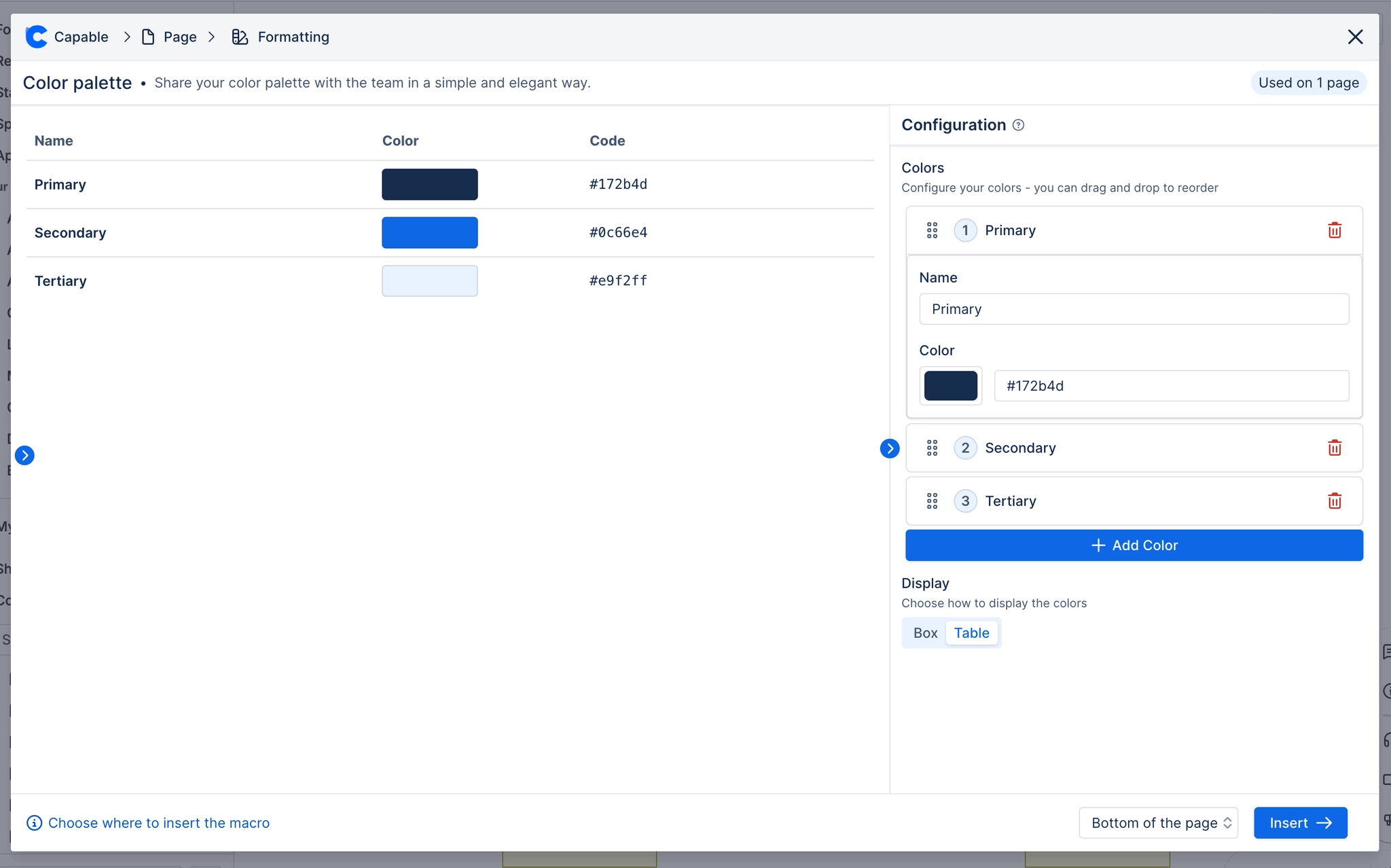
Colors | A reorderable list; each entry has "Name" (free text) and "Color" (a colour picker plus a hex text field) | The palette itself. Entries are added with "Add Color" (which appends "New Color" / #123456), removed with the bin icon, and reordered by dragging the grip handle. Order is the render order. |
Display | Box, Table | Box renders a single 75px-tall bar split into equal segments, one per colour, each labelled with its name and growing on hover. Table renders a three-column table: Name, Color (a clickable swatch), Code (the hex, select-all). |
Corner radius | Slider, 0–24 px | Rounds the frame around the whole palette and clips the content to it. At 0 there is no rounding on the outer container (the Box display keeps its own internal rounding). |
Border | Off / On; when on, "Width" slider 0–6 px and a colour field | Draws a light frame around the whole palette. The Style tab explains it as off by default because the swatches are meant to be the focus. |
#Related
Small, and quietly useful.