Cards
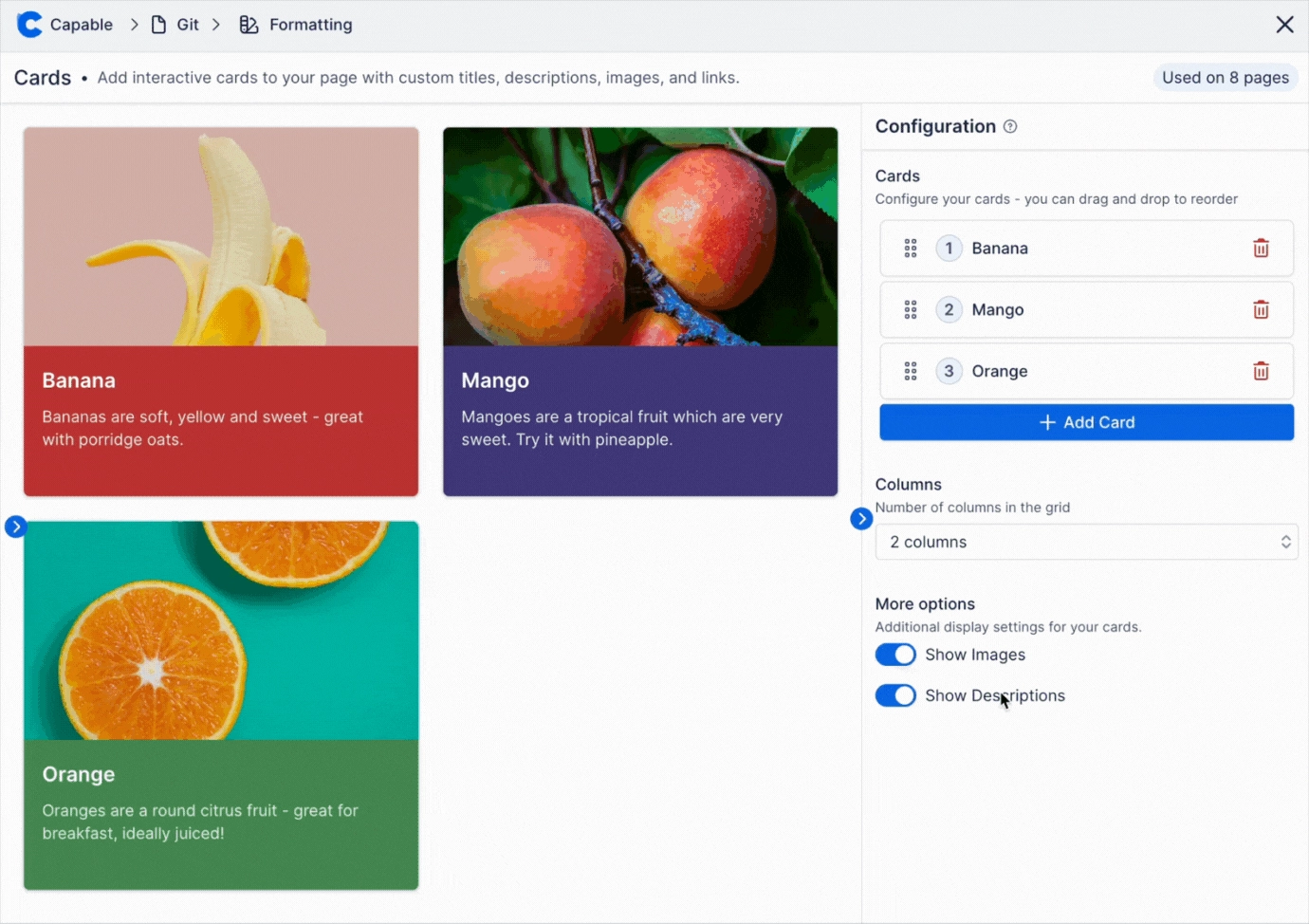
A grid of up to six coloured cards, each with a title, description, optional image and optional link to a page or a website.
Cards is the macro you reach for when a page needs a visual index rather than a list, a landing page for a space, a 'start here' hub, a set of feature highlights, or a row of team or product tiles. Each card carries its own background and text colour, so a grid can be colour-coded by theme without touching any page styling. Cards can be purely decorative (link type None), point at an external site, or point at another Confluence page picked from a search box. The Style tab controls the whole grid at once, columns, spacing, corner rounding, shadow, border, image size and position, title size and hover behaviour, so all cards stay visually consistent while their content differs.
#See it
Every example below is a real macro on this page, not a screenshot, and each one is a configuration taken from a page somebody actually built. Open this page in the editor to see how any of them is set up.
#6 cards, 3 columns, with images: Approval

Approval
Request approval and feedback on your pages.

Calendars
Manage important schedules spread across pages.

Diagrams
Insert over 20 types of diagrams with visual or text editors.

Github
Securely embed code, diagrams, markdown

Headings
Automatically number your headings.

Images
Upload and share images to a shared library.
#3 cards, responsive columns, left: Banana


#3 cards, 3 columns, left: Banana
#3 cards, 3 columns, with images: Dragon Fruit

Dragon Fruit
Dragon fruit is a tropical fruit known for its unique appearance and sweet flavor.

Rambutan
Rambutan is a juicy, hairy-skinned fruit native to Southeast Asia, offering a sweet and slightly acidic taste.

Durian
Known as the 'king of fruits', durian has a strong aroma and creamy texture that divides opinions.
#Settings
Setting | Values | What it changes |
|---|---|---|
Title | Free text | The card heading. Clamped to two lines in the live render; longer titles are visually truncated. Also what the config panel shows as the card's accordion label. |
Description | Free text (multi-line textarea) | The body line under the title. Clamped to three lines. Hidden entirely when the grid-level Show descriptions toggle is off. |
Image | A picked attachment, an uploaded file, a recently-used URL, or a pasted URL. Placeholder reads "No media selected". | The card's picture. Root-relative and Confluence paths are rebased onto the site host so page attachments load for everyone including logged-out readers; other hosts go through Capable's image proxy when the viewer has a token. |
Image Alt Text | Free text | Accessible alternative text for the card image. When empty the renderer falls back to the card's Title. NO CONTROL EXISTS FOR THIS IN THE CONFIG PANEL, it is only ever set by a starter template, by the AI generator, or by an agen |
Link (Link Type) | URL, Page, None (dropdown showing an icon on the trigger, labels in the list) | Chooses the card's destination. URL reveals a free-text URL box and opens in a new tab. Page reveals a Confluence page search box and navigates in the same tab. None removes the link entirely, no pointer cursor, no keyboard focus |
Link URL | Any URL (placeholder "https://…") | Where an external card goes. Only shown and only used when Link Type is URL. Opened via openUrl in a new tab. |
Page (Page ID) | A Confluence page chosen from a type-ahead ("Start typing page name") | Where an internal card goes. Only shown and only used when Link Type is Page. Navigates in the same tab. |
Background | A brand colour swatch, or any custom colour when the admin allows custom colours | The card body's fill in light mode. A dark-mode counterpart is derived from it automatically (same hue, saturation capped, lightness pinned above the page background). |
Text | A brand colour swatch, or a custom colour | The card's title and description colour in light mode. In dark mode the app substitutes a near-black or near-white that reads on the derived dark background. |
Columns | Auto, or a fixed count from 1 to 6 | Auto fits as many columns as the page width allows, targeting about three on a normal page and about two in thin mode, with cards stretching to fill. A fixed count renders exactly that many columns and caps their width (2 cols: 48 |
Alignment | Left, Center, Right | Where the whole grid sits across the page width. |
Gap | Slider, 0 to 48 px | Space between cards, both horizontally and vertically. |
Padding | Slider, 0 to 32 px | Inner padding of each card's text area. |
Corner radius | Slider, 0 to 24 px | How rounded each card's corners are. |
Shadow | None, S, M, L | Resting drop shadow under each card. |
Border | Off / On. When On, a Width slider (0 to 6 px) and a colour swatch appear. | Draws a visible outline on every card. When off, cards still carry an invisible 2px transparent border so turning it on does not shift the layout. |
Show images | On / Off | Hides the image band on every card at once. Cards with no image configured never show a band regardless. |
Image position | Top, Left, Right | Whether the picture sits above the text (a vertical card) or beside it (a horizontal card). In Left/Right the image column takes 38% of the card width in Confluence. |
Image fit | Cover, Contain | Cover fills the image band and crops the overflow; Contain fits the whole picture inside the band and may letterbox. |
Image height | Slider, 80 to 400 px, in steps of 4 | Height of the image band on a top-image card. On a left/right card it becomes the image column's minimum height instead. |
Show descriptions | On / Off | Hides the description line on every card, leaving title-only cards. The description text is kept in the config, not deleted. |
Title size | S, M, L | Type scale of the card heading (S = 14px, M = 16px, L = 18px). |
Hover effect | None, Lift, Zoom | What a linked card does under the pointer. Lift raises the shadow and nudges the image 5%; Zoom scales the image 10%. Applies only to cards that actually have a link, and is suppressed entirely in the editor's live preview. |
#Related
A landing page, not a document.