Banner
A full-width photo banner or rotating carousel, each slide carrying a headline, a line of body text and an optional button.
Use Banner for the hero strip at the top of a space home page, a landing page or an onboarding page, the thing a reader sees first. Each slide is a photo with a headline, a short paragraph and an optional call-to-action button that links to a Confluence page or an external URL. With one slide it is a static hero; with several it becomes a carousel with arrows, dots and optional auto-advance. It is a standalone block: you configure it entirely in its own panel rather than typing into it on the page.
Type | Stands on its own |
|---|---|
PDF and Word export | See below |
Published Capable Site | Supported |
Name in the picker | Banner (Capable) in the suite. The standalone app usually adds the word macro |
#See it
Every example below is a real macro on this page, not a screenshot, and each one is a configuration taken from a page somebody actually built. Open this page in the editor to see how any of them is set up.
#3 slides, with images: Confluence is better with Capable


#3 slides, auto-scrolling, with images: Introducing the new experience


#With images: New here? Start with the guide

#With images: Welcome to the program hub

#Settings
Setting | Values | What it changes |
|---|---|---|
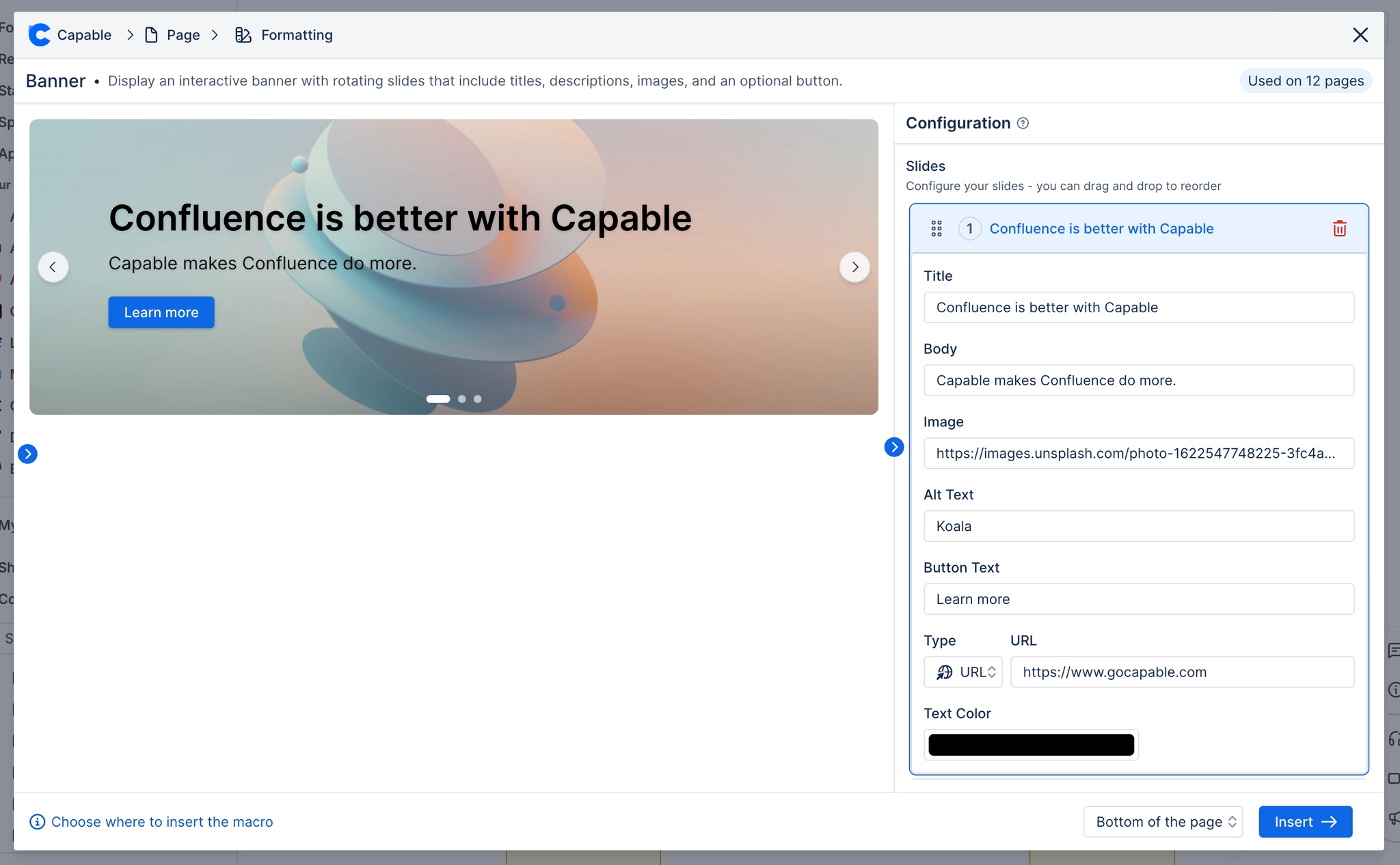
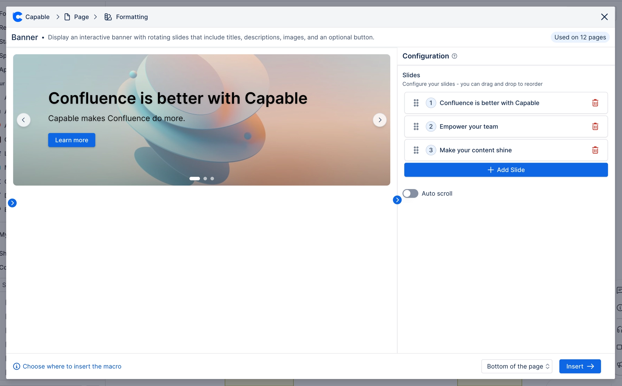
Slides | A list. Each slide is an expandable row you can drag by its grip handle to reorder, and delete with the bin icon. An "Add Slide" button appends a new one seeded from one of the three built-in sample slides at random. | Each slide becomes one panel of the carousel, in list order. |
Title | Free text. Required. | The slide's large headline. Long titles wrap rather than truncate. |
Body | Free text. Required. Line breaks you type are preserved on the page. | The paragraph under the headline, rendered slightly transparent. |
Image URL | An image URL, a Confluence attachment, or empty. The config field is labelled "Image" and opens the same picker as elsewhere (attachments, pasted URL, Unsplash search). | The slide's background photo, sized to cover. |
Image Alt Text | Free text. | The accessible description of the slide photo, read by screen readers. |
Button Text | Free text. | The label on the slide's call-to-action button. See the caveat: leaving this empty hides the button entirely, whatever link you configured. |
Link Type | URL, Page, None, shown as a compact icon dropdown labelled "Type" | Chooses where the slide's button goes. Picking Page swaps the next field for a Confluence page picker and clears any URL; picking URL clears any page and shows a URL box; picking None shows the text "No link" and hides the button |
Link URL | Any URL. Field is labelled "URL" and only appears when Link Type is URL. | Where the button opens. |
Page ID | A Confluence page, chosen by typing its name in a picker. Field is labelled "Page" and only appears when Link Type is Page. | The button opens that Confluence page. |
Text Color | A brand colour (Text role) or custom, with a clear button. Field description in the panel reads "Overrides the automatic light/dark text. Clear to pick automatically from the image." | Forces the colour of the slide's title, body and button label. Cleared, the macro samples the average brightness of the slide photo and picks white or black. |
Auto scroll | On or off | When on, the carousel advances by itself. Silently does nothing when the banner has only one slide. |
Auto scroll interval (seconds) | 2 to 60, whole seconds. Field is labelled "Interval (seconds)" and only appears when Auto scroll is on. | How long each slide is shown before advancing. |
Corner radius | 0 to 24 pixels | Rounds the whole banner's corners; the slides and photos are clipped to the same shape. |
Shadow | None, S, M, L | Adds a resting drop shadow under the banner. |
Border | Off or on. When on, a Width slider (0-6px) and a colour picker appear. | Draws an outline around the banner. |
Overlay opacity | 0 to 1, in steps of 0.05 | How strong the dark (or tinted) wash over each slide photo is at its strongest point. The wash is a gradient: full strength at the bottom of the slide, a sixth of that at the middle, and clear at the top. Set to 0 to remove it ent |
Overlay colour | A brand colour (Background role) or custom. Panel hint reads "Gradient tint over each slide image, strongest at the bottom and fading out towards the top." | The colour of that wash. It also doubles as the solid fill for any slide whose photo cannot be shown, see caveats. |
Button fill | A brand colour (Accent role) or custom, with a clear button. Panel hint reads "Fill colour for slide buttons. Leave unset to match the slide's automatic light/dark button." Applies to EVERY slide's button, not per slide. | Forces a fixed background colour on all slide buttons. The label takes the slide's Text Color if set, otherwise a colour chosen to contrast the fill. Left unset, each button picks a light or dark variant based on how bright its ow |
#Related
Give the eye somewhere to land.