Background
Wraps a block of page content in a coloured or photo-backed container so it stands out from the rest of the page.
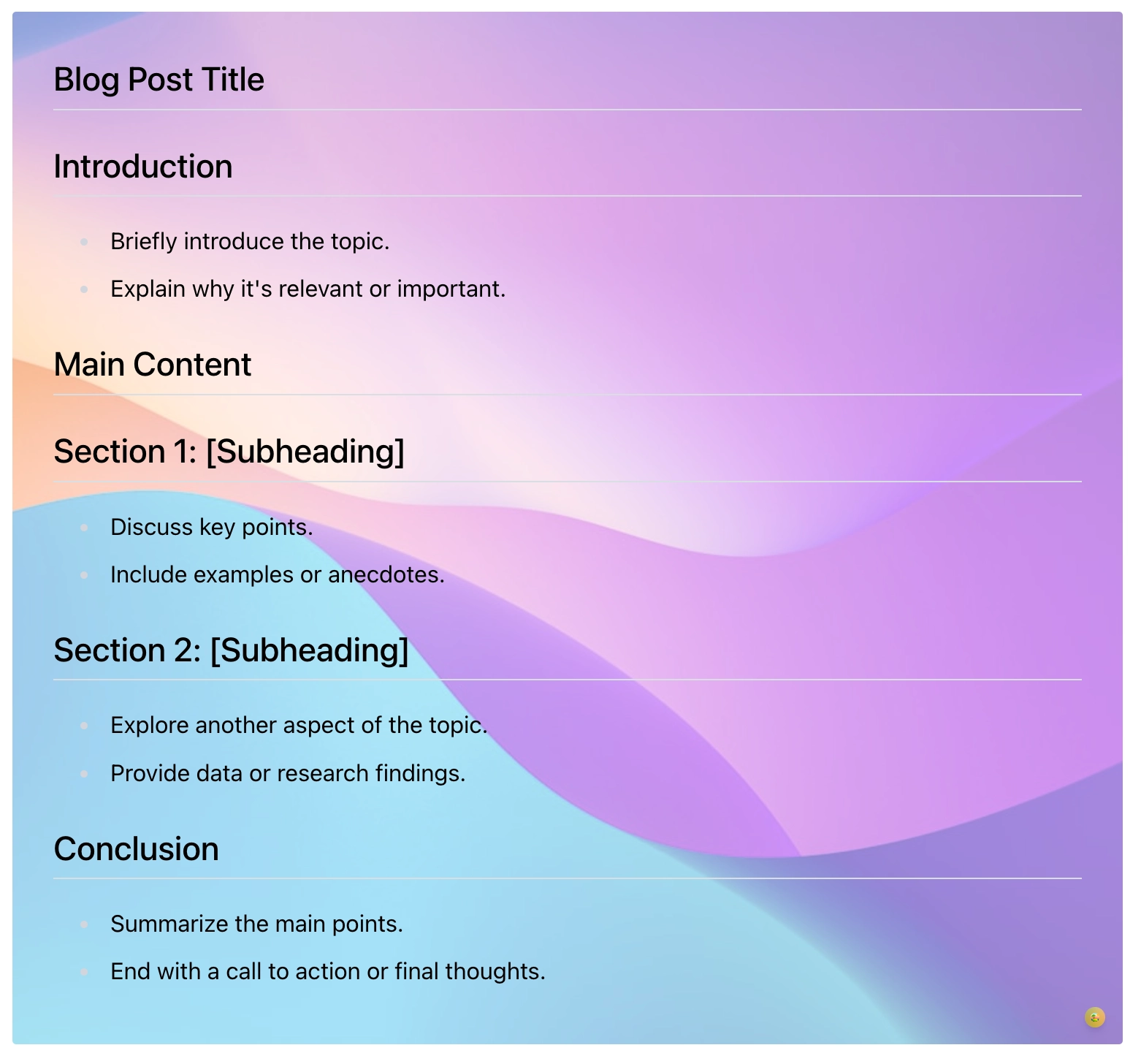
Use Background when a section of a page needs to read as a distinct block, a hero at the top of a space home page, a coloured callout for a warning, or a tinted panel around a short introduction. You type your content directly inside the macro on the page, exactly as you would anywhere else, and the macro paints a background behind it: a solid colour, a photo, or a photo faded back over a colour. It is the closest thing Capable Formatting has to a "panel", and the shipped templates lean into that ('Info callout', 'Warning panel'). Reach for it when a native Confluence panel is too plain and you want control over height, padding, corner radius, shadow and a background image.
Type | Wraps content on the page |
|---|---|
PDF and Word export | See below |
Published Capable Site | Supported |
Name in the picker | Background (Capable) in the suite. The standalone app usually adds the word macro |
#See it
Every example below is a real macro on this page, not a screenshot, and each one is a configuration taken from a page somebody actually built. Open this page in the editor to see how any of them is set up.
#With images

#Settings
Setting | Values | What it changes |
|---|---|---|
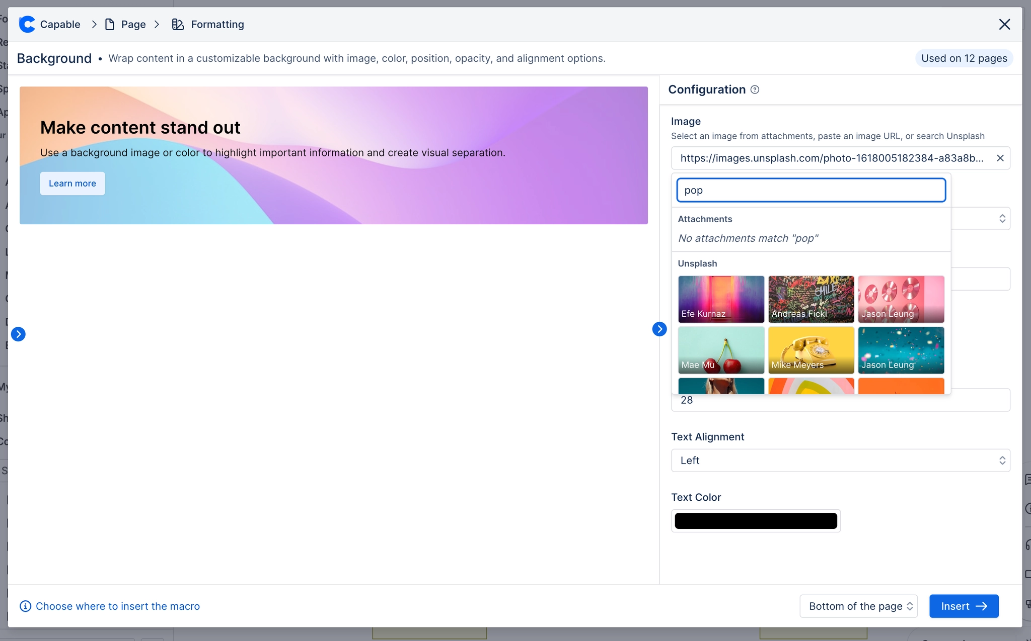
Image URL | Any image URL, a Confluence attachment path, or empty. The config panel field is labelled "Image" and opens a picker offering page attachments, a pasted URL, or an Unsplash search. Has a clear button. | Paints a photo across the whole container, behind your content, sized to cover and clipped to the corner radius. Cleared, the container is just the background colour. |
Background color | Any colour. The picker offers the tenant's brand colours (Background role) plus a custom picker when the admin allows custom colours. | Fills the container. Also shows through wherever the image is transparent or faded by Image opacity, and is the entire look when there is no image. |
Text color | Any colour, from brand colours (Text role) or custom. | Colours the text of everything you put inside the macro. See the readability caveat: this value can be overridden automatically when no image is showing. |
Image opacity | 0 to 1, in steps of 0.05 | Fades the background image so the background colour shows through it. At 0 the image is invisible but is still downloaded; at 1 it fully covers the colour. |
Image position | Center, Top, Bottom, Left, Right | Chooses which part of the photo stays visible when it is cropped to the container's shape (it is always sized to cover). |
Side spacing (px) | 0 to 200 | Left and right padding inside the container, between the edge and your content. Does not affect top and bottom padding, which are fixed. |
Text alignment | Left, Center, Right (shown as three icon buttons) | Aligns the text inside the container. |
Height | Wrap (labelled "wrap text" in the stored value), Medium, Large, Custom | Wrap lets the container be as tall as its content. Medium forces a minimum of 200px, Large forces 300px, Custom uses the Custom height value. Anything other than Wrap also increases top/bottom padding from 2rem to 3rem. |
Custom height (px) | 50 to 1000, in steps of 10 | The minimum height of the container. |
Border radius | Shown to you as a 0-16 pixel slider. Stored as a 0-1 fraction that is multiplied by 16. | Rounds the container's corners. The background image is clipped to the same rounded shape. |
Shadow | None, S, M, L | Adds a resting drop shadow under the container. |
Border | Off or on. When on, a Width slider (0-6px) and a colour picker appear. | Draws an outline around the container. |
#Related
Give the eye somewhere to land.