Animated banner
A full-width animated hero banner with a label, headline, subtitle and call-to-action button.
Space homepages and landing pages usually open with a wall of text, and nothing tells a first-time visitor what this space is or where to go next. This macro drops in a single polished hero banner: an animated background, an uppercase label, a headline, a supporting line and one button that points at a page or a URL. Reach for it at the very top of a team space home, an onboarding hub or a launch page, anywhere you want the page to announce itself. It is a different macro from Banner (cf-mc-banner), which is a static coloured callout strip: this one is a large animated hero block with its own typography and a CTA.
Type | Stands on its own |
|---|---|
PDF and Word export | See below |
Published Capable Site | Supported |
Name in the picker | Animated banner (Capable) in the suite. The standalone app usually adds the word macro |
#See it
Every example below is a real macro on this page, not a screenshot, and each one is a configuration taken from a page somebody actually built. Open this page in the editor to see how any of them is set up.
#Aurora, Ocean: Aurora drift
#Mesh, Slate: Mesh gradient
#Constellation, Cobalt: Welcome to the team space
#Constellation, Slate: Constellation
#Settings
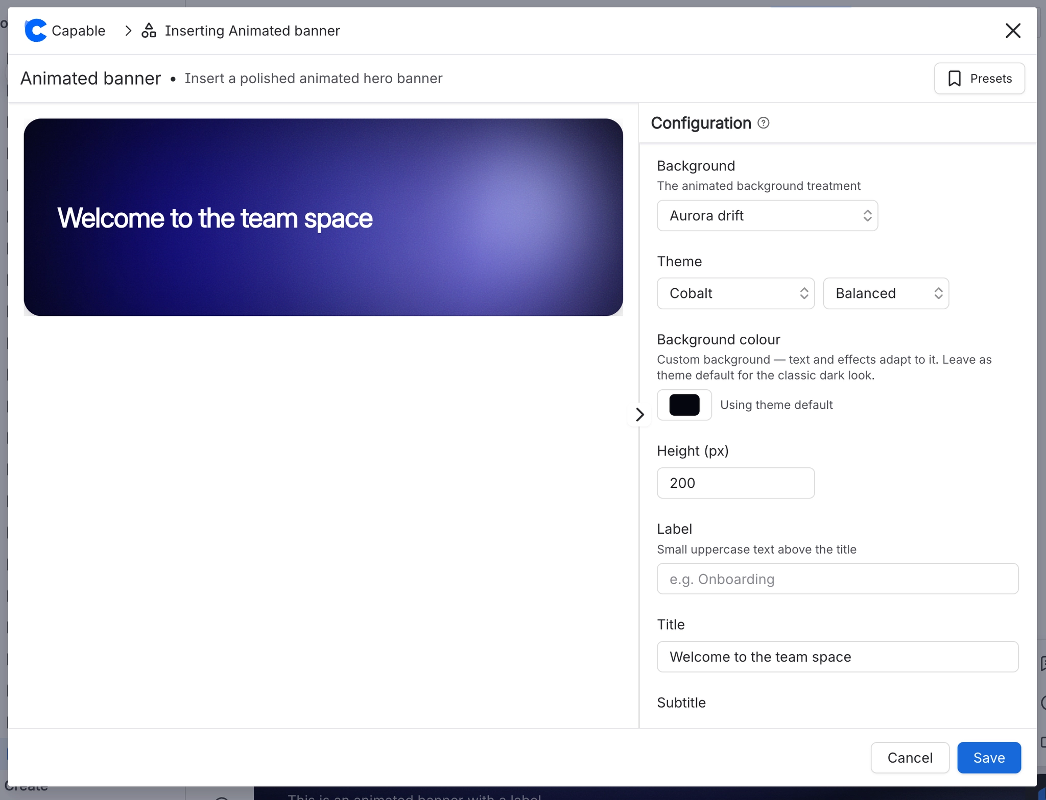
Setting | Values | What it changes |
|---|---|---|
Background | Aurora drift, Mesh gradient, Orbit rings, Light sweep, Constellation, Dot wave, Flow field, Bokeh drift, Wave bands, Halftone ripple | The animated background treatment. The first four are drawn with CSS; the remaining six are drawn on a canvas. |
Speed | Calm / Balanced / Lively (0.55× / 1× / 1.7×) | How fast the background animation moves. |
Background colour | A brand or custom colour, or cleared (the panel then reads "Using default background" with a "Reset to default" button once set) | The flat base colour sitting behind the animated effect. The headline, subtitle, button and legibility scrim all re-derive themselves from this colour's brightness, so a light base flips the text to dark automatically and stays re |
Accent colour | A brand or custom colour, or cleared ("Using theme accent" / "Reset to theme") | The highlight colour of the animated effect and of the small dot beside the Label. Setting it replaces the theme's effect colours with a light-to-dark ramp built from your colour. On a light background the dot is darkened automati |
Height (px) | 120–600 | How tall the banner block is. The value is clamped when you leave the field rather than while typing. |
Film grain | On / Off | Overlays a fine noise texture so the gradients look softer and less flat. |
Label | Free text, up to 40 characters (placeholder: "e.g. Onboarding") | A small uppercase, letter-spaced line above the headline, preceded by a coloured dot. Leave it empty and neither the label nor the dot renders. |
Title | Free text, up to 90 characters (placeholder: "Banner headline") | The main heading, set large and bold. |
Subtitle | Free text, up to 140 characters (placeholder: "Optional supporting line") | A supporting line under the headline, constrained to about half the banner width so it never runs under the animation's focal point. |
Button | Free text, up to 40 characters (placeholder: "Optional button label") | The call-to-action label. Leave it empty and there is no button, and the Button link row does not even appear in the config panel. |
Button link (type) | None / URL / Page | How the button resolves where it goes. URL takes a web address; Page opens a Confluence page picker; None shows "No link" and suppresses the button entirely. |
Button link, URL | Any web address (placeholder: "https://…") | The destination when the link type is URL. |
Button link, Page | A Confluence page chosen with the picker ("Start typing page name") | The destination when the link type is Page. |
#Related
Give the eye somewhere to land.