
Set up your brand
The single highest-value thing an administrator can do here is set the brand guidelines once. Every macro's colour control then starts from your colours rather than ours.
It is also the cheapest way to stop pages looking like six people built them, because it works by default rather than by instruction.
#What to set
Setting | What it controls |
|---|---|
Brand colours | The five colour roles every macro's colour control offers |
Corners | How rounded macro corners are, everywhere |
Shadow | The default shadow depth |
Spacing | Default padding inside macros |
Alignment | The default alignment |
Allow colour picker | Whether authors can pick freeform colours or only your brand roles |
#The five colour roles
Colours are chosen by role rather than by value, which is what lets one choice work across macros that look nothing alike.
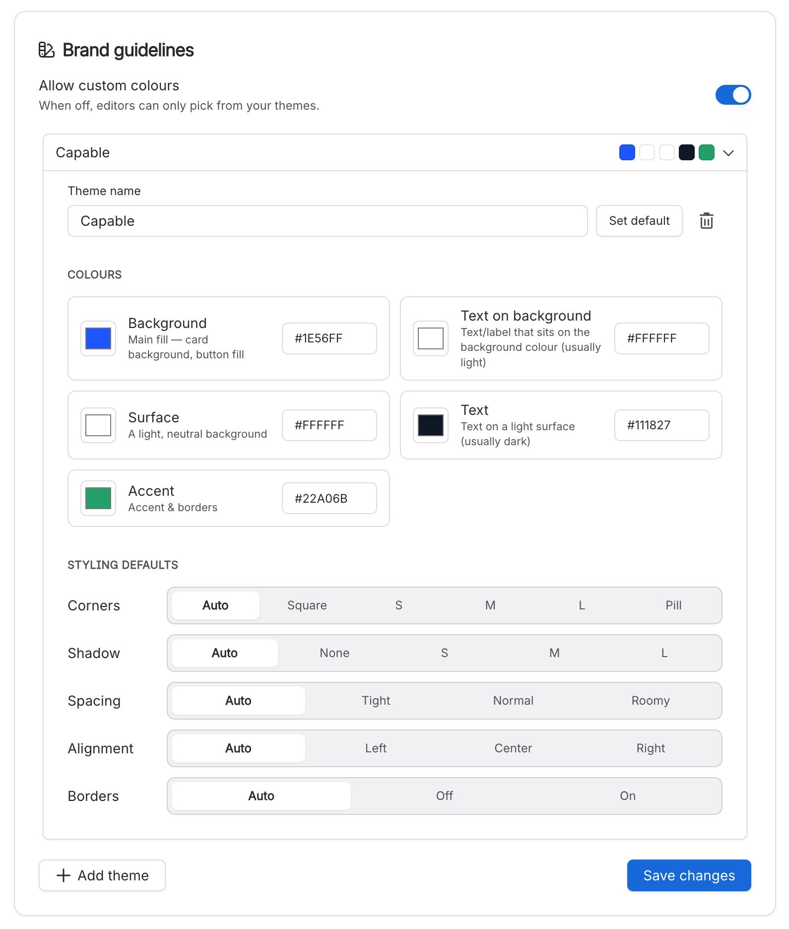
Background the surface a macro sits on.
Text on background what must stay readable against it.
Surface a raised area inside a macro, such as a card.
Text what must stay readable on that surface.
Accent the emphasis colour: buttons, progress fills, highlights.
Turning off the colour picker is a real decision. It stops authors choosing freeform colours, which enforces consistency and will annoy anybody who wanted a one-off. Decide it deliberately.
#Then add presets
Once the brand is right, save macro presets for the configurations your teams use repeatedly. Ten per macro, across twenty supported macros, authored through the real macro form.
#A few things worth knowing
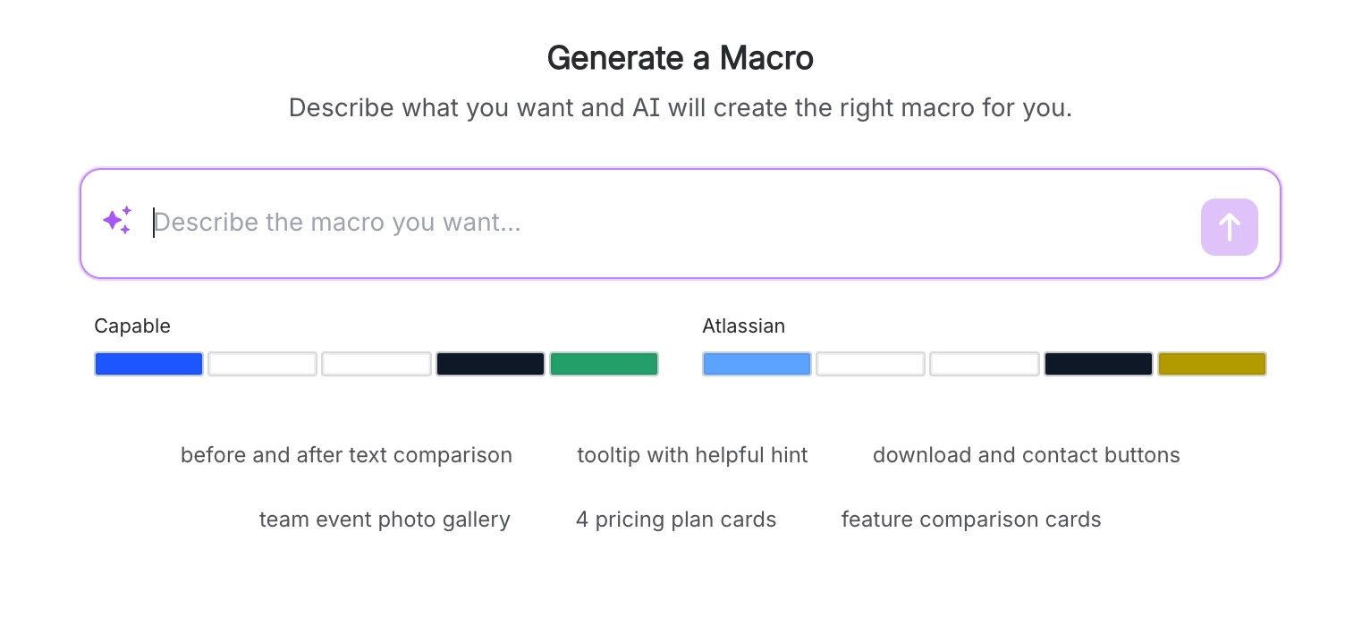
Brand guidelines are per theme, so check both light and dark before you call it done.
Changing the brand later updates macros that use brand roles, and leaves freeform colours alone.
This is site-wide and needs a Confluence administrator.
#Related
Twenty minutes. Every page benefits.























