Gallery
A set of images shown either as a grid of equal-height cells or as a swipeable carousel, with the alt text doubling as an optional caption.
Gallery is for putting a collection of pictures on a page without hand-building a table of images, screenshots of a release, photos from an event, a set of diagrams, a wall of product shots. You add images one at a time from page attachments, an upload, a recently-used URL or a pasted URL, give each one alt text, then choose between a grid ('Masonry') and a one-at-a-time carousel. Because the alt text is also the caption, writing accessible alt text and labelling the picture are the same action. Grid styling, columns, cell height, gap, corner radius, shadow, border, caption colour and hover ring, is set once for the whole gallery.
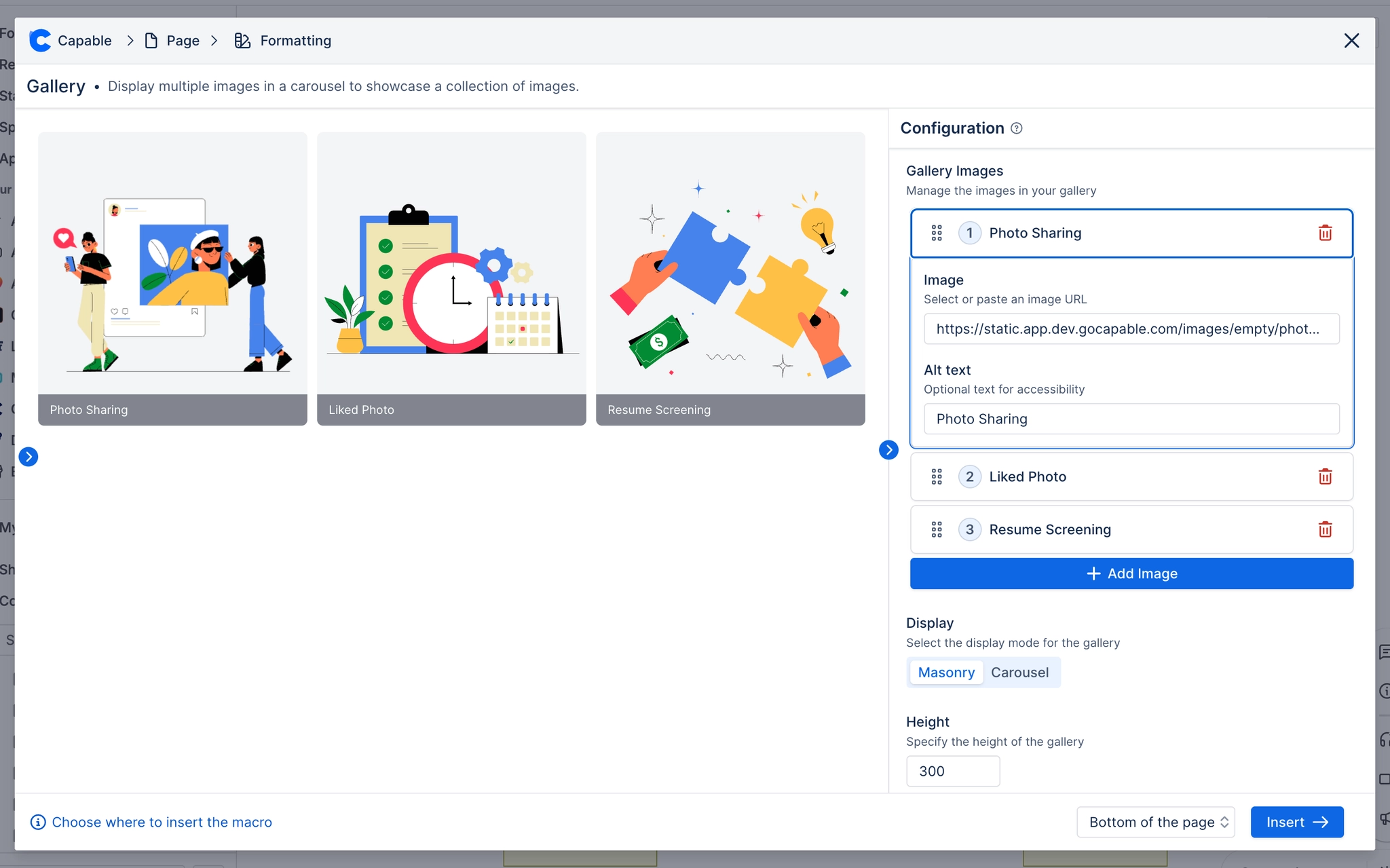
#See it
Every example below is a real macro on this page, not a screenshot, and each one is a configuration taken from a page somebody actually built. Open this page in the editor to see how any of them is set up.
#3 columns, carousel, with images


#3 columns, masonry, with images



#Masonry, with images


#Settings
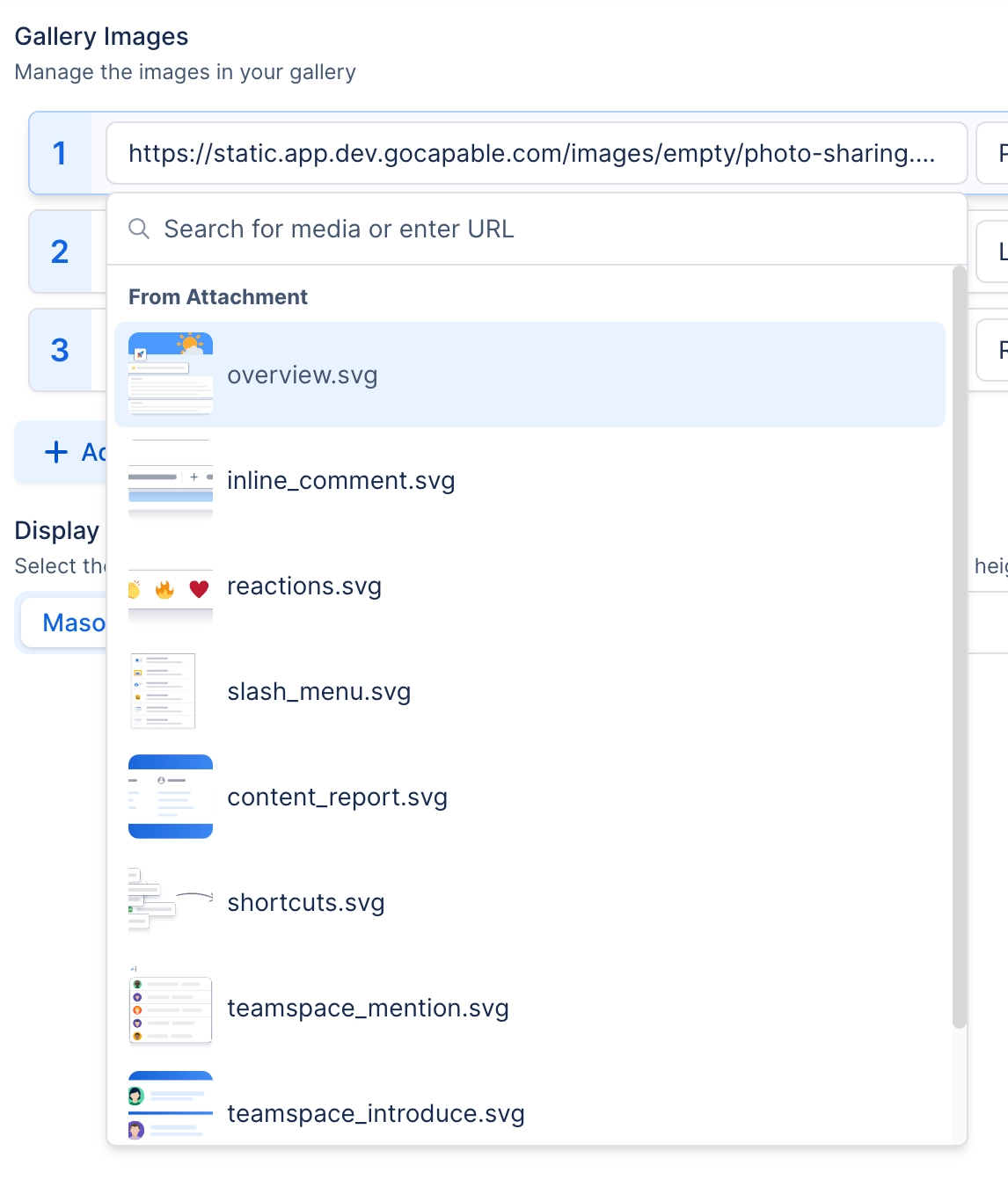
Setting | Values | What it changes |
|---|---|---|
Gallery Images → Image | A picked attachment, an uploaded file, a recently-used URL, or a pasted URL. Description under the field reads 'Select or paste an image URL'; placeholder reads 'No media selected'. | One cell of the gallery. Images are re-ordered by dragging the grip handle in the list. |
Gallery Images → Alt text | Free text. Description under the field reads 'Optional text for accessibility'. | Does three jobs at once: the image's accessible alt attribute, the hover tooltip on the cell, and, when Show captions is on, the visible caption. It is also the label the image shows in the editor's list. |
Display | Masonry, Carousel | Masonry lays every image out in a grid of equal-height cells. Carousel shows one image at a time, full width, with previous/next arrows, drag-to-scroll and looping. |
Columns | Auto, or a fixed count from 1 to 6. Hint: 'Auto fits columns to the available width.' | Auto fits as many columns as the page width allows, using a 200px minimum track. A fixed count renders exactly that many equal columns. Only shown in the editor when Display is Masonry. |
Height | Slider, 200 to 2000 px, in steps of 10 | In Masonry, the height of every grid cell. In Carousel, the height of the single image frame. The frame is a fixed box on purpose, without one, Cover and Contain would look identical. |
Image fit | Cover, Contain | Cover fills the cell and crops what does not fit; Contain fits the whole image inside the cell and may letterbox. |
Show captions | On / Off. Description: 'Show alt text as a caption. When off, alt text is only the image's hover tooltip.' | On, the alt text renders as a visible caption, an overlay bar across the bottom of the cell in Masonry, or centred text beneath the image in Carousel. Off, the alt text is still the accessible alt and the hover tooltip, just not |
Corner radius | Slider, 0 to 24 px | How rounded each grid cell is. |
Gap | Slider, 0 to 48 px | Space between grid cells. |
Shadow | None, S, M, L | Resting drop shadow on each grid cell. |
Border | Off / On. When On, a Width slider (0 to 6 px) and a colour swatch appear. | Draws an outline around each grid cell. |
Caption background | A brand colour swatch or custom colour; can be cleared. Hint: 'Background behind image captions. Leave unset for the default translucent bar.' | Replaces the default translucent caption bar with a solid colour. Applies in both light and dark themes identically. |
Caption text colour | Any colour | Overrides the caption text colour. THERE IS NO CONTROL FOR THIS IN THE CONFIG PANEL. It is only ever set by your organisation's brand scheme, and only alongside a caption background (a white on-background colour on the default tra |
Hover accent | A brand colour swatch or custom colour; can be cleared. Hint: 'Ring colour shown when hovering an image. Leave unset to use the theme accent.' | Colour of the 2px ring drawn around a grid cell under the pointer. |
#Related
A landing page, not a document.