RSS feed
Pulls the latest items from one or more RSS or Atom feeds onto the page, as a list, a table or an image gallery.
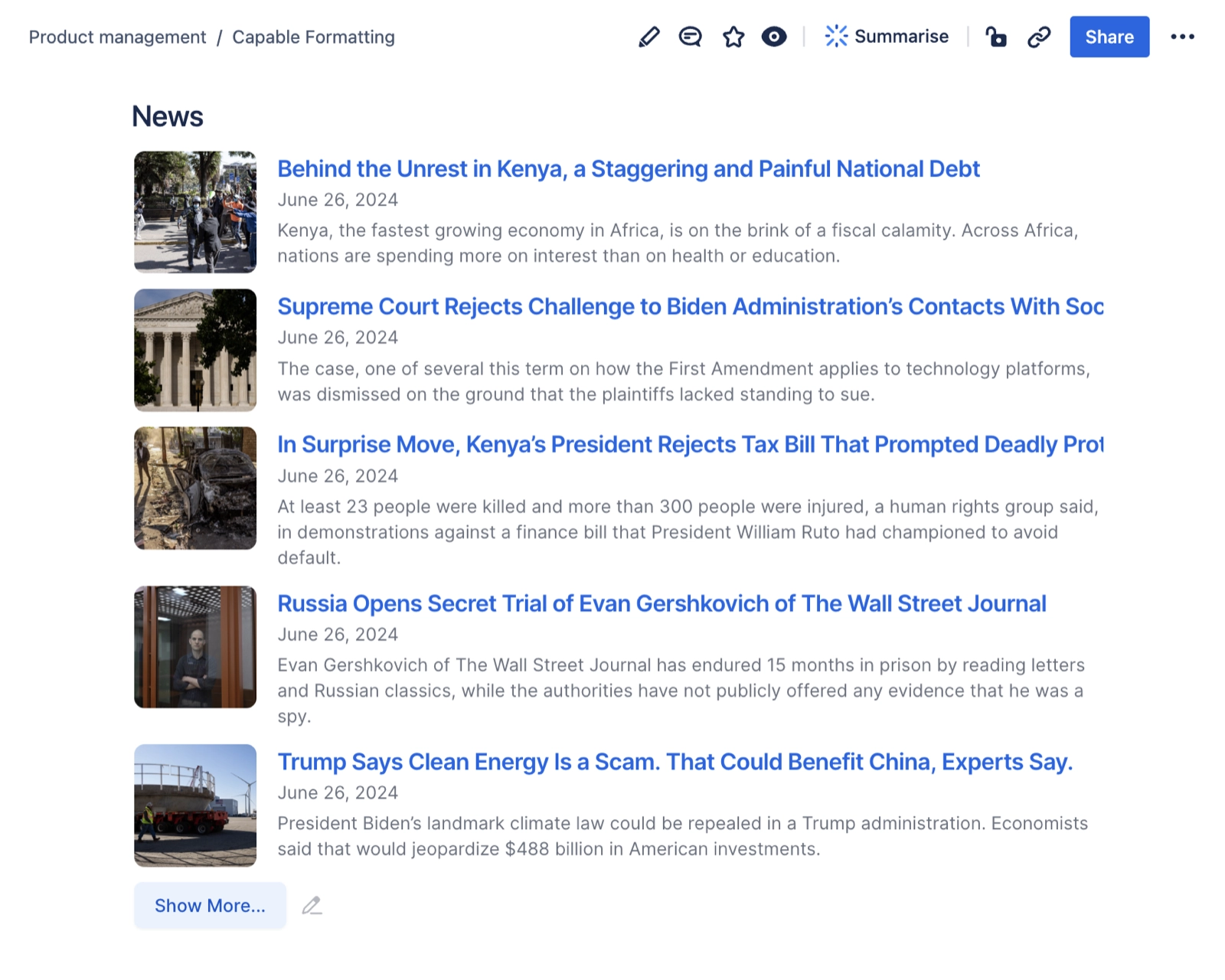
Teams keep pasting the same links into the same page and it goes stale within a week. This macro reads live RSS or Atom feeds and renders the newest items in place: company blog posts on a space home, a vendor's changelog on a runbook, industry headlines on a team dashboard. Add several feeds and they merge into a single newest-first stream with the source name beside each date. Reach for it whenever the value of a page is "what has happened recently" and you do not want to be the person maintaining it. It also ships three ready-made starting points and a picker of well-known feeds, so a useful version is about four clicks away.
#See it
Every example below is a real macro on this page, not a screenshot, and each one is a configuration taken from a page somebody actually built. Open this page in the editor to see how any of them is set up.
#Articles with images
#Articles
#Table
#Grid
#Settings
Setting | Values | What it changes |
|---|---|---|
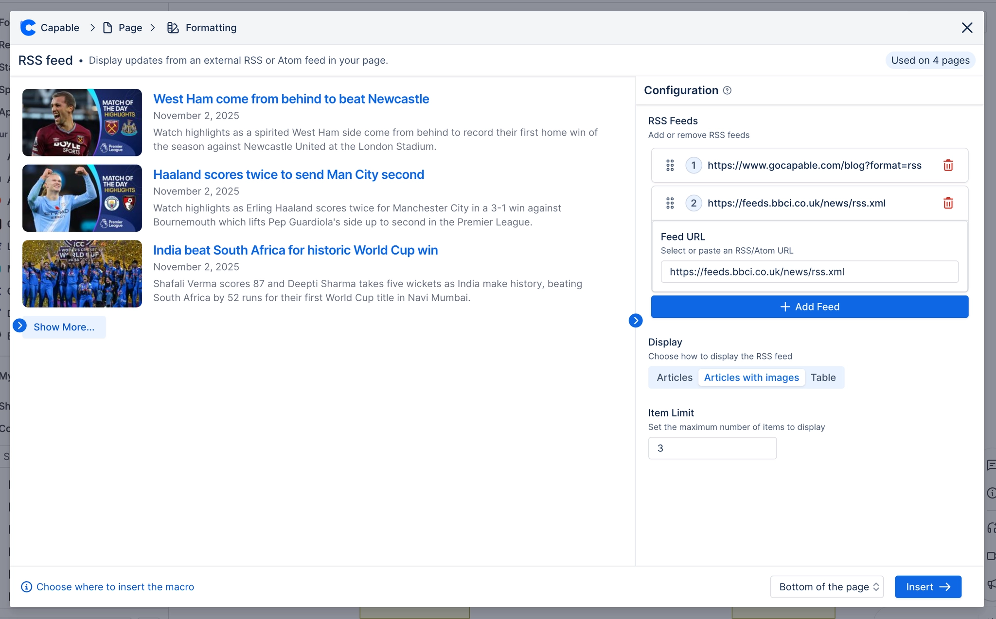
RSS Feeds, Feed URL | Pick from the built-in suggestions (Capable Blog, TechCrunch, BBC News, Engadget, Microsoft Blog, Facebook Engineering Blog, NASA Breaking News, Atlassian Forge Changelog, XKCD) or paste any RSS/Atom URL. Feeds are added, reordered by dragging and deleted individually. | The feeds to read. Items from every feed are merged and sorted newest-first. |
RSS Feeds, Name (optional) | Free text (placeholder: "e.g. Company Blog") | A label for that feed, shown next to each item's date. Described in the panel as "Shown next to the date when more than one feed is added". |
Display | Articles ("Display articles in a simple list format") / Articles with Images ("Display articles with thumbnail images") / Table ("Display articles in a table format") / Gallery ("Display articles in a grid gallery with image backgrounds") | The layout. Chosen from four illustrated cards on the Style tab. |
Item limit | 1–500 | How many items are shown initially. Described as "Maximum number of items to display". If the feed has more, a "Show More..." button appears and reveals another batch each press, with a "Collapse" link to go back. |
Columns | Responsive, or a fixed 1–6 columns | Described as "Responsive fits columns to the available width; or pick a fixed count". Responsive fits as many columns as the page width allows, for the article layouts that means it stays single-column until roughly 920px wide, b |
Gap | 0–48 px slider | Spacing between items in the grid layouts. |
Corner radius | 0–24 px slider | Rounds article thumbnails and gallery card corners. |
Card shadow | None / S / M / L | Described as "Resting drop shadow on article and gallery cards". |
Border | Off / On; when on, a Width slider (0–6 px) and a colour picker | Described as "Adds a card surface to the article layouts and outlines gallery cards". Turning it on is one of the two ways to give the article layouts an actual card look. |
Show overlay | On / Off | Described as "Dark gradient drawn over each image behind the text", it is what keeps gallery card text readable over a bright photo. |
Show text | On / Off | Described as "Article title and date shown on each gallery card". Turn it off for a pure image wall. |
Link colour | A brand or custom colour, or cleared | Described as "Article title colour, and the gallery title's hover tint. Leave unset to use the theme accent". |
Card background | A brand or custom colour, or cleared | Described as "Fills the gallery cards, and gives the article layouts a card surface (so shadow, corners and border show). Leave unset for the default". |
#Related
The largest family, and the most precise.