Service status
Live health of one or more Statuspage.io service pages, as a card grid or an expandable list.
Use this on a runbook, an operations dashboard or a team home page to show at a glance whether the services you depend on are up. Point it at any Statuspage.io-hosted status page - Jira, Confluence, GitHub, OpenAI, Sentry, Zoom and Capable are offered as one-click choices, and you can paste any other. The simple view gives you a card per service with a coloured indicator; the detailed view expands each service into its components, open incidents and scheduled maintenance windows, so you can triage without leaving the page.
#See it
Every example below is a real macro on this page, not a screenshot, and each one is a configuration taken from a page somebody actually built. Open this page in the editor to see how any of them is set up.
#Detailed
Service status (static):
#Simple
Service status (static):
#Settings
Setting | Values | What it changes |
|---|---|---|
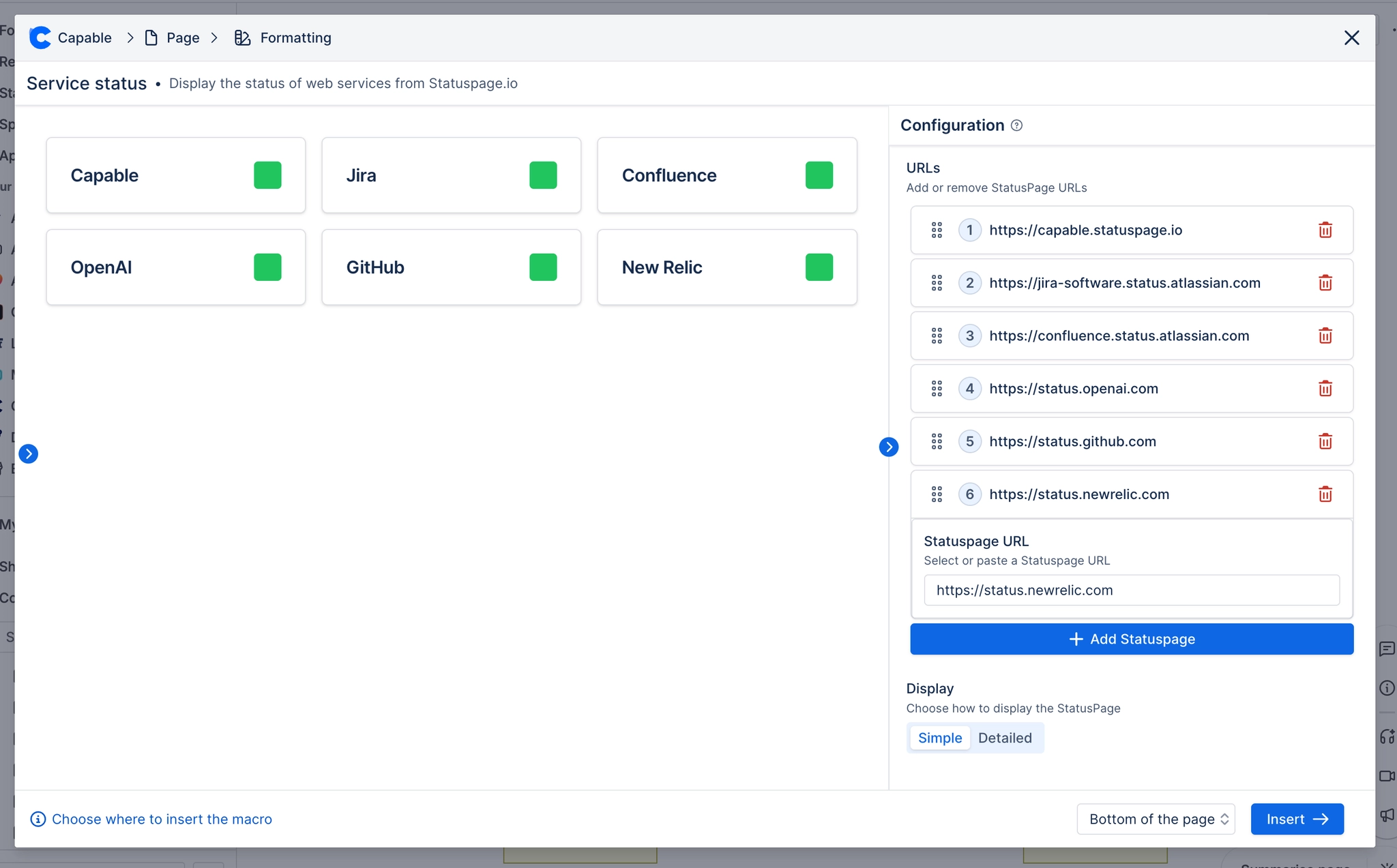
URLs | A list of Statuspage URLs, reorderable by dragging | Which status pages are shown, one card (or one accordion row) each. Panel description: "Add or remove StatusPage URLs". The Add button seeds a new row with status.newrelic.com. |
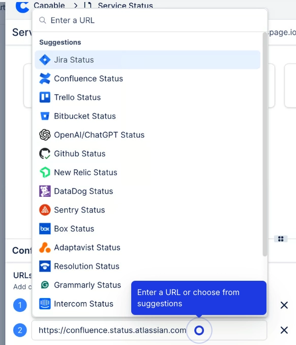
Statuspage URL (per entry) | Pick from the built-in list (Capable, Jira, Confluence, OpenAI, Github, Sentry, Zoom) or paste any URL | The service to check. Panel description: "Select or paste a Statuspage URL". The macro derives the API endpoint from the host, so the exact path you paste does not matter. |
Custom Title (per entry) | Free text, optional | Overrides the service name shown on the card. Panel description: "Optional custom title to display instead of the status page name", placeholder "Leave empty to use status page name". |
Display | simple / detailed | simple gives a responsive grid of cards, each with the service name and a coloured status pill. detailed gives an accordion: each row expands to list the service's components with their individual states, current incidents with th |
Corner radius | 0–24 px | Rounds the status cards. Card view only. |
Gap | 0–48 px | Space between status cards in the grid. Card view only. |
Shadow | None / S / M / L | Drop shadow on each status card. Card view only. |
Border | Off, or on with a Width (0–6 px) and a colour | Replaces the card's default hairline border with one you choose. Width and colour only appear once the toggle is on. Card view only. |
#Related
These carry state. Keep them true.