Progress bar
A coloured bar that shows how far along something is, optionally draggable by readers who can edit the page.
Use this when a number needs to be felt rather than read - sprint completion, budget burned, seats filled, fundraising against a target. It is not limited to percentages: you set your own Minimum and Maximum, so a bar can run 0–40 story points or 0–5000 in currency and still fill correctly. The optional Label and Unit print directly on the bar ("Completion 65%", "Raised 3200 GBP"), so the bar carries its own caption and needs no surrounding sentence. Its most useful trick is "Allow changing from the page": with that on, anyone who can edit the page can drag the bar in the published view and save, without opening the editor - which turns a status page into something a team actually keeps current.
#See it
Every example below is a real macro on this page, not a screenshot, and each one is a configuration taken from a page somebody actually built. Open this page in the editor to see how any of them is set up.
#Center, 80%
#Left, 100%
#Left, 65%
#Left, 33%
#Settings
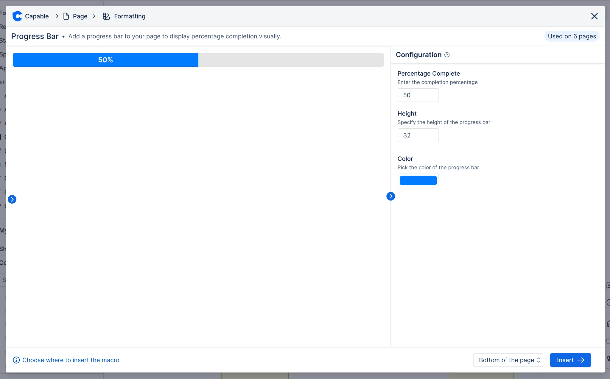
Setting | Values | What it changes |
|---|---|---|
Value | Any number. Clamped into Minimum…Maximum when rendered. Slider in the panel runs Minimum→Maximum in increments of Step. | Where the bar fills to. Deliberately unbounded in the schema (it is a value on your own scale, not a percent) - the renderer normalises it against Minimum/Maximum. |
Allow changing from the page | On / Off | When on, a reader who holds edit permission on the page sees the bar as a button; clicking it exposes a drag handle and Save/Cancel. Saving writes the new value back into the macro's stored config. When off (and for everyone witho |
Label | Free text | Printed on the bar before the value, e.g. "Completion 65%". Panel description: "Optional label shown on the bar". |
Unit | Free text | Printed after the value. "%" is appended with no space; any other unit gets a leading space ("3200 GBP"); clearing it prints the bare number. Panel description: "Shown after the value (e.g. %, items, $)". |
Minimum | Any number | The bottom of your scale. Retyping it pulls Value back inside the new range. |
Maximum | Any number | The top of your scale. If Maximum is not greater than Minimum the panel shows "Maximum must be greater than minimum." and the bar renders empty. |
Step | Number, minimum 0.01 | The increment the slider (in the panel) and the in-page drag handle move by. |
Bar width (px) | 50–3000, or empty | Fixes the track width in pixels. Left empty the bar stretches to the column. Panel description: "Leave empty for full width". |
Alignment | Left / Center / Right | Where a fixed-width bar sits in the column. Has no visible effect on a full-width bar. |
Height | 5–50 px | Bar thickness. Also drives the label type size (half the height, floor 10px). Non-numeric stored values are coerced and clamped at render. |
Fill | Brand palette colour or custom colour | The colour of the filled portion. Also the colour the brand "primary background" role maps to when a bar is inserted into a branded tenant. |
Track | Brand palette colour or custom colour | The colour of the unfilled remainder. |
Label text | Brand palette colour, custom colour, or cleared | Colour of the text printed on the bar. Left empty, the macro picks black or white automatically for contrast against the Fill colour. Panel hint: "Leave empty to pick black or white automatically for contrast." |
Corner radius | 0–50 px | Rounds the bar's corners. At high values on a tall bar you get a pill. |
Shadow | None / S / M / L | Drop shadow behind the whole bar. |
#Related
These carry state. Keep them true.