Progress tracker
A horizontal row of numbered, optionally linked steps showing where a process has got to.
Use this to show a reader where they are in a sequence - an onboarding flow, a release checklist, an approval pipeline, a multi-page guide. Completed steps get a tick, the current step is highlighted, upcoming steps stay muted. Each step can link to a Confluence page (via a page picker) or to any URL, so the tracker doubles as navigation across a set of pages that belong together. There is also an AI "Generate" button in the editor: describe a workflow in a sentence and it drafts the step list for you.
#See it
Every example below is a real macro on this page, not a screenshot, and each one is a configuration taken from a page somebody actually built. Open this page in the editor to see how any of them is set up.
#5 steps: Plan
#4 steps: Draft
#3 steps: Create account
#Settings
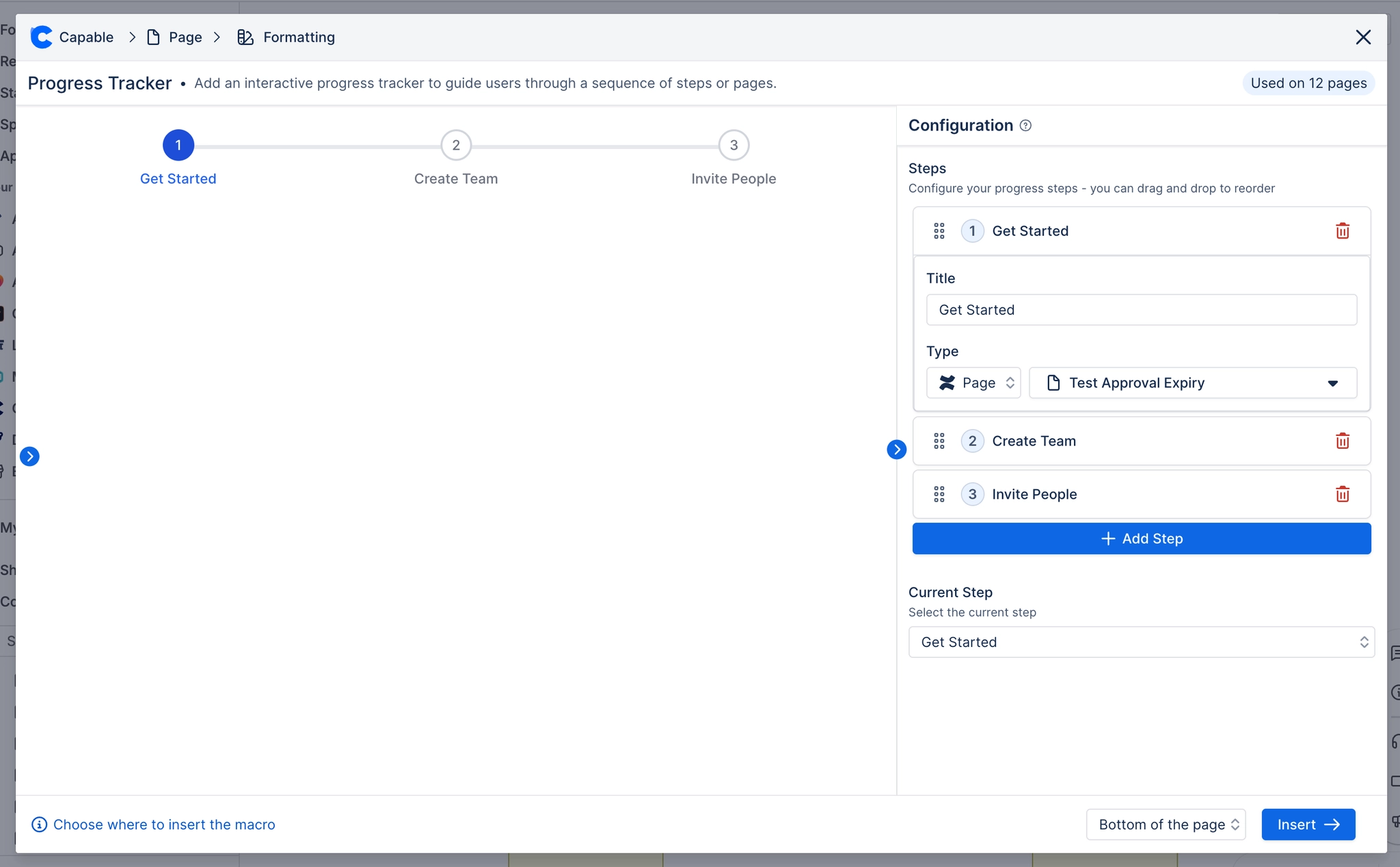
Setting | Values | What it changes |
|---|---|---|
Steps | Between 2 and 20 steps. Reorderable by dragging. | The steps drawn left to right. Panel description: "Configure your progress steps - you can drag and drop to reorder". The Add Step button is disabled at 20; the delete button is hidden once only 2 steps remain. |
Title (per step) | Free text, required | The caption printed under the step's circle. |
Type (per step) | none / url / page | Whether the step's caption is a link. 'url' shows a URL field, 'page' shows a Confluence page picker, 'none' renders the caption as plain text with no link and no pointer cursor. |
URL (per step) | Any URL | Where the step opens when Type is 'url'. Only shown in the panel when Type is 'url'. |
Page (per step) | A Confluence page, chosen with the content picker | Where the step opens when Type is 'page'. Navigates in-product to that page. |
Current Step | A step, chosen from a dropdown of your step titles | Everything before it renders as completed (tick, accent fill, connector filled). It renders highlighted. Everything after it renders as upcoming. Panel description: "Select the current step". |
Accent | Brand palette colour or custom colour | Completed step circles, the filled part of the connector line, and the current step's caption text. |
Current step | Brand palette colour or custom colour | The current step's circle fill and border - a deliberately darker shade of the accent so the current position stands out from the completed ones. |
Track | Brand palette colour or custom colour | The unfilled connector rail behind the accent fill. |
Upcoming text | Brand palette colour or custom colour | Captions of every step that is not the current one, plus the number inside an upcoming step's circle. |
Show Controls | On / Off | NOTHING. See caveats. |
Show Details | On / Off | NOTHING. See caveats. |
#Related
These carry state. Keep them true.