Buttons
A row or column of styled buttons that link out to a website or across to another Confluence page.
Use this when a page needs an obvious next action rather than a sentence with a link in it, "Raise a request", "Open the runbook", "Go to the dashboard". You can put several buttons in one macro and they lay out as a row or a column with a gap you control, so it doubles as a small navigation strip at the top of a landing page. Each button can be styled independently: preset colour variants, or your own fill and label colours drawn from your organisation's brand palette. A button can point at an external URL, at a Confluence page you pick from a search box, or at nothing at all when you just want the look.
#See it
Every example below is a real macro on this page, not a screenshot, and each one is a configuration taken from a page somebody actually built. Open this page in the editor to see how any of them is set up.
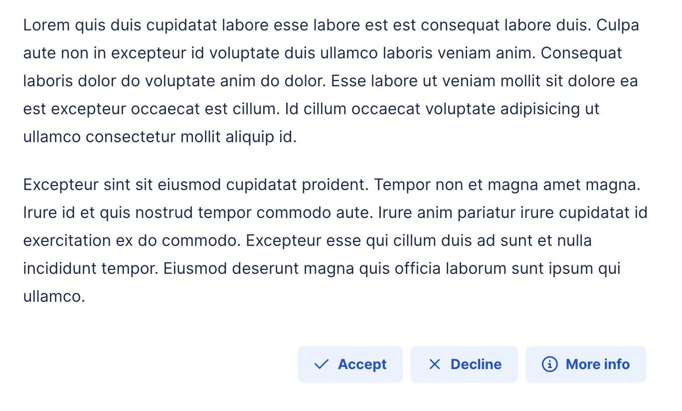
#7 buttons, horizontal, left: Red
#4 buttons, left: Open website
#3 buttons, horizontal, center: Website
#1 button, horizontal, left: Right Aligned Icon
#Settings
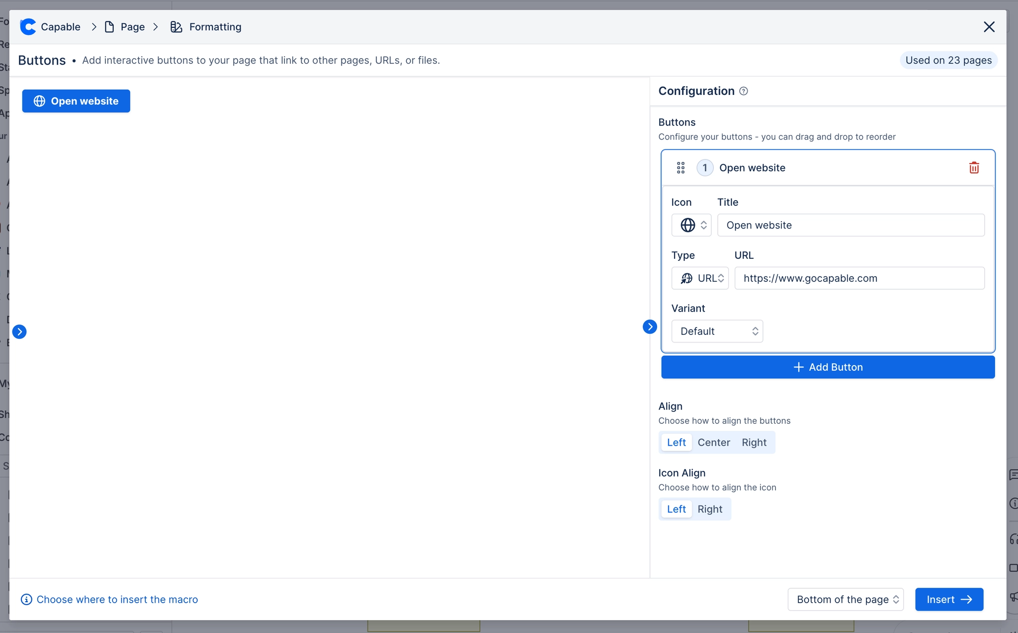
Setting | Values | What it changes |
|---|---|---|
Title | Free text | The button label. When "Icon only" is on the label is hidden and becomes the hover tooltip instead. |
Type | URL, Page, None | Chooses the destination. URL uses the URL field; Page uses the Page picker; None makes the button non-clickable (a decorative pill). |
URL | Any URL | Where the button goes. Only used when Type is URL. |
Page | A Confluence page chosen from a search picker | Which page the button opens. Only shown and only used when Type is Page. Stored as the numeric page id; the button navigates to /wiki/pages/viewpage.action?pageId=<id>. |
Icon | A picture list including none, arrows (left/right/up/down), check, file, folder, home, info, minus, plus, search, times, globe, user, book, users, cloud, server, palette, sparkles, warning triangle, calendar, shield, swords, pen and more | Puts a small icon on the button, on the side set by "Icon position" (or the button's own override). |
Variant | Default, Success, Warning, Destructive, Outline, Secondary, Ghost, Link, Custom | The colour preset. Choosing Custom (or picking any Fill/Label colour) switches the button to your own inline colours instead of the preset. |
Size | S, M, L | Changes the button's actual height and font size (32px / 36px / 40px tall). |
Corners | None, S, M, L, Pill | Corner radius. Pill gives the fully-rounded social-link look. |
Fill | A brand-palette colour or a custom hex (clearable) | Background colour for this button. Setting it silently switches Variant to Custom. |
Label | A brand-palette colour or a custom hex (clearable) | Text colour for this button. Setting it also switches Variant to Custom. |
Full width | On / Off | Stretches this button to fill the row. |
Icon only | On / Off | Hides the label and renders a square icon-only button; the title becomes the hover tooltip. |
Alignment | Left, Center, Right | Where the whole button group sits horizontally. Called "Align Buttons" in the underlying schema. |
Direction | Row, Column | Whether the buttons flow across the page or stack vertically. |
Gap | 0 to 48 (px slider) | Space between the buttons. |
Icon position | Left, Right | Default side the icon sits on for every button in this macro. Called "Icon Alignment" in the underlying schema. |
Open links | New tab, Same tab | Applies to every button in this macro. Same tab navigates within Confluence; New tab opens a new browser tab. |
#Related
The two most used macros here.