Site layout
Your sites use a responsive layout:
Desktop: Three-column layout — sidebar (page tree), main content, table of contents
Tablet: Two-column layout — sidebar collapses to toggle
Mobile: Single-column layout — sidebar and TOC available via toggles
#Header
The site header contains:
Site logo and title (links to homepage)
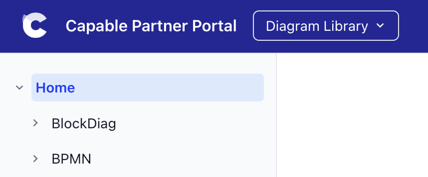
Space switcher dropdown (if multiple spaces are assigned)
Search bar with full-text fuzzy search
Theme toggle (light/dark mode)
Sidebar toggle (on mobile)
Header links (Add up to 10 custom links to the site header)
#Homepage
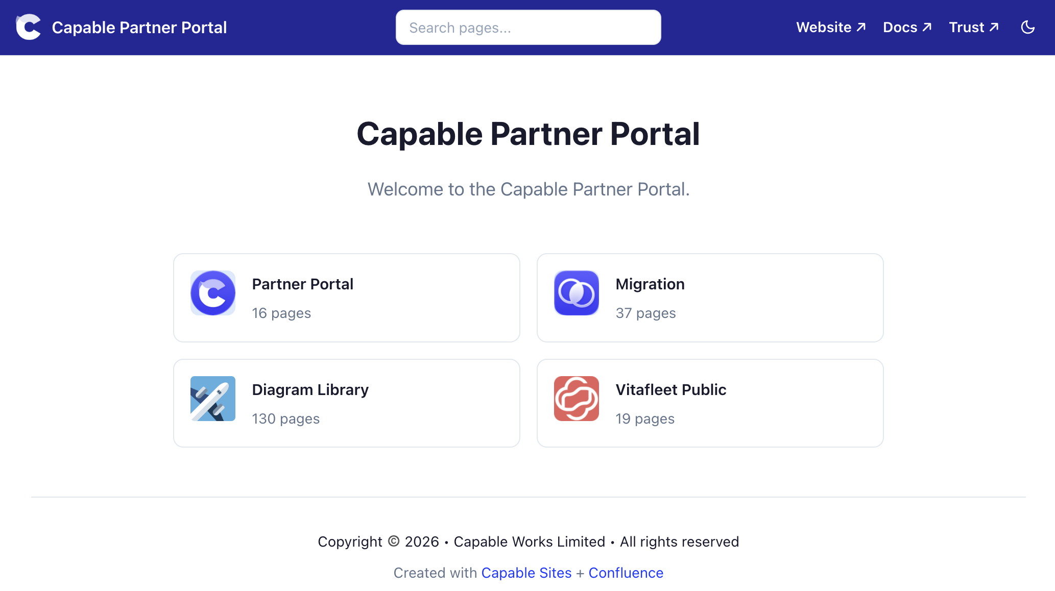
You can choose between a space card grid, showing all published spaces, or you can instead choose a homepage on the Scope tab that will be shown by default:
#Space tabs or dropdown
Enable the Show space tabs option to display a horizontal tab bar below the header, showing all assigned spaces. This provides quick navigation between spaces without using the dropdown.
#Space tabs disabled and more than one space
#Space tabs enabled
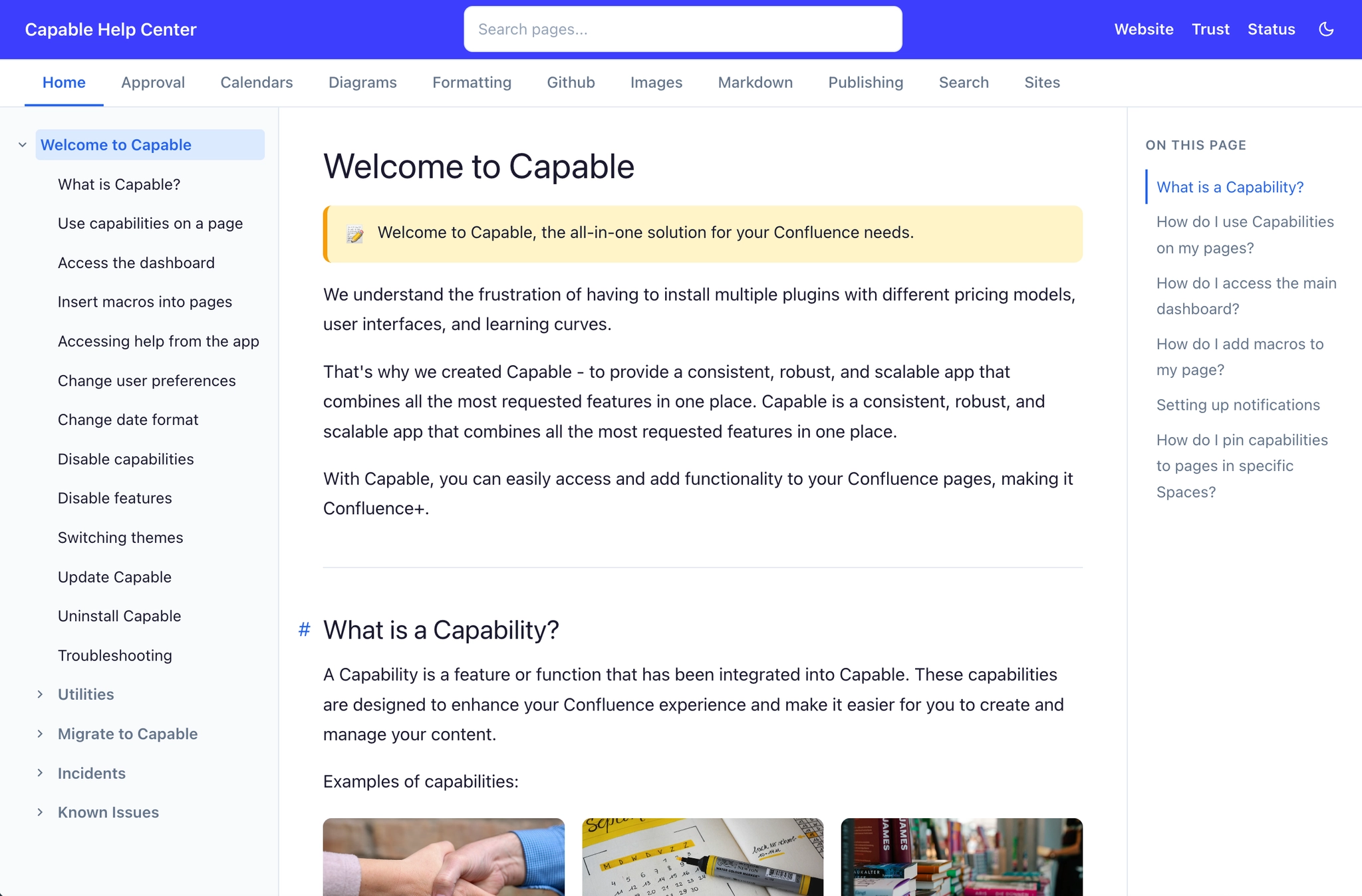
#Sidebar page tree
Each space has a sidebar showing its page hierarchy as a collapsible tree. The current page is highlighted, and parent sections expand automatically. On mobile, the sidebar is hidden by default and accessible via a toggle button.
#Table of contents
A table of contents is automatically generated from the headings on each page and displayed in the right sidebar. On narrower screens, it collapses or is hidden.
#Footer
A footer appears at the bottom of every page. You can set custom footer text (up to 500 characters) that appears above the default "Created with Capable Sites + Confluence" branding line.
#Search
Sites include built-in full-text search. A search index is pre-built during site generation, covering all page titles and content. Visitors can search across all spaces from the search bar in the header.